| Image |
Comment |
| 08/31/2002 02:05:00 PM |
|
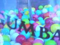
| 08/31/2002 12:28:00 PM |
Gumballsby malapropamComment: Good composition and focus. The DOF (unsharp letters, sharp gumballs) creates a good feel for the depth. I like the uneven (tilted?) lines. The letters in one direction and the "gumballs horizon" in the other. The colouring looks strange and a bit bluish (neon lights?) but it's OK. Not every photo must have the super-saturated and vivid colours. It makes the photo look older which is not a bad thing for a "childhood" theme. -stephan |
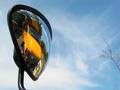
| 08/31/2002 01:37:00 PM |
Pepito's Childhood Scarsby chakkobboComment: Nice photo! A different background than one which has almoist the same colour like the plush would be better. Flashlight is ok here because it creates these nice bright points in the eyes which makes pepito alomost alive. -stephan |
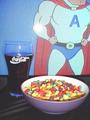
| 08/31/2002 12:51:00 PM |
Saturday Morningby MarkRobComment: Very nice. Goof composition. The lighting is a bit odd. I think you used a flash. Flash is a bad lighting, especially from such a short distance. The glare on the TV, the contrasty light on the stuff in the bowl... all because of the flash. It just looks so unnatural. It's not like we walk around with light bulbs as out heads ;-) Even if you would have just switched off the flash and let the TV be the only light source, it would be better. The glass and the bowl would have been silhouettes against the TV but it would look like as if I sit in front of the TV. I don't know if it was intended but what I like is the nice contrast of the unhealthy cola and the sweets(?) (what is it?) to the superman body of the action hero. It's like "I want to be like him" *sip* "mhh... cola" ;-) -stephan |
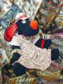
| 08/31/2002 01:13:00 PM |
let's play dress up!by lecookComment: Hmm it looks like you just used a stuffed animal because children were not allowed. The background is not chosen very well. It merges with the cloths of the subject and is too distracting in my opinion. Also the saturation (esp. of the red colour) is a bit too much. -stephan |
| 09/01/2002 01:04:00 PM |
|
| 08/31/2002 01:23:00 PM |
Castles and Shellsby MiekaComment: Uh oh. I would really like to hear why you tilted he camera. It's not good in this case I think. The calm light (sunset) is somehow working against the chaotic influence of the tilt. I think if the photo weren't tilted it would be one of my top favourites. Anyway, good lighting and focus. I like the contrast of the blue/red of the toys and stones. -stephan |
 Photographer found comment helpful. Photographer found comment helpful. |
| 08/31/2002 01:31:00 PM |
Carefree by mcmurmaComment: Very good. I know how difficult it is to phorograph bubbles in the sky. It's good that you chose a more narrow DOF. That way I can see some depth and that some bubble are nearer than others. Good work! -stephan |
| Photographer found comment helpful. |
| 08/31/2002 01:00:00 PM |
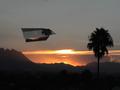
Flying Paper Planes From Grandpa's Roofby amonteforteComment: Nice idea using the same motive on the paper. A bit motion blur would be nice to symbolise the movement of the paper plane (in case it really flew and you didn't set it up... Hm do I see a small string across the palm tree? ;-) Good composition, lighting(!) and focus. -stephan |
| 08/31/2002 01:05:00 PM |
|
Home -
Challenges -
Community -
League -
Photos -
Cameras -
Lenses -
Learn -
Help -
Terms of Use -
Privacy -
Top ^
DPChallenge, and website content and design, Copyright © 2001-2025 Challenging Technologies, LLC.
All digital photo copyrights belong to the photographers and may not be used without permission.
Current Server Time: 08/14/2025 12:35:48 PM EDT.