| Image |
Comment |
| 10/20/2002 09:25:00 PM |
|
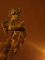
| 10/20/2002 09:05:00 PM |
Become Wrath by greenem2Comment: Excellent! Personally I love photo's of this kind where one colour sticks out. And in this case it's not just a cheap effect but serves the purpose of the photo. Composition, lighting and focus (well chosen DOF) are also very good. I guess many will gripe about the "overexposure". It's not! It adds to the stark expression. I especially like the wrinkles which express the emotion perfectly. This is one of my favourite photos this week. Good job! -stephan |
 Photographer found comment helpful. Photographer found comment helpful. |
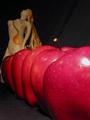
| 10/20/2002 12:58:00 PM |
The First Sinby RichiComment: I think focus and lighting don't match. Your focus is on the statue in the background but your lighting highlights the apples in the front. That's why I would like the photo better without the flash(?) light on the apples and more light on the statue. I also think one apple would be enough. More just distract too much. -stephan |
| 10/20/2002 01:04:00 PM |
Gambling Angerby freeoglasiComment: Cool stop motion! Lighting and composition aren't that good, but that's very difficult in such shots. -stephan |
| 10/20/2002 09:40:00 PM |
Apple Skinby kosmikkreeperComment: The following is not meant in a lustful manner, but the apple peeling is distracting. Without it the nicely lit body could stand on it's own (as a subject). And this apple=sin theme also isn't very creative anymore ;-) -stephan |
| Photographer found comment helpful. |
| 10/21/2002 07:35:00 PM |
Angelic Prideby stephanComment: Wow, many thanks to all who commented. At first I wanted to submit the photo with a title suggesting a gluttony theme, but after looking at it for some time the statue looked more like "pride" to me. I don't know exactly what it was at the end but the expression in the face, the raised finger and especially the raised position and the angle made him look almost arrogant to me. And that's what I wanted to show. There is a kind of pride which I think is tolerable. That's the pride ones own achievements for example. But there is another kind of pride more meaning "arrogance" (at least my dictionary lists it). This is what I personally really dislike very much. The angel's expression conveyed exactly that (to me), so I submitted it. Regarding the lighting... As described in the photo details the photo was taken at night with very long exposure times. The rays come from a lantern which stands right after the right edge of the photo. The orange tone comes from the white balance which I intentionally set to "sunny". |
| 10/21/2002 01:07:00 AM |
Untitledby gumbootchaComment: I didn't have the time to vote on your photo in time, but I like it very much. The focus on the hand is great! I also like the colouring. But I have to admit that I don't get the connection to the challenge theme, too. It would be nice if you could explain it a little bit. |
| 10/20/2002 09:10:00 PM |
|
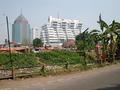
| 10/13/2002 07:20:00 AM |
Society contrastby prkembyComment: Just a suggestion... I would have tried to zoom in a bit more. Then one could see more of the houses in the foreground. I don't think the street and the palm trees were necessary to convey what you wanted to say, so you could have cropped them out. Anyway, a good effort. It's a creative take on the challenge. This photo has a message. Keep shooting. -stephan |
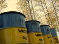
| 10/13/2002 08:15:00 AM |
Standing Tallby spillerComment: Nice angle! I like how the trees in the background are aligned to the barrels. Unfortunately the photo suffers from bad JPEG compression. E.g. on the first barrel in the front you see these typical distortions. That's not necessary. You can use up to 150 kB for your photo. -stephan |
| Photographer found comment helpful. |
Home -
Challenges -
Community -
League -
Photos -
Cameras -
Lenses -
Learn -
Help -
Terms of Use -
Privacy -
Top ^
DPChallenge, and website content and design, Copyright © 2001-2025 Challenging Technologies, LLC.
All digital photo copyrights belong to the photographers and may not be used without permission.
Current Server Time: 08/14/2025 10:32:43 AM EDT.