| Image |
Comment |
| 11/24/2002 08:51:00 AM |
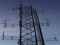
Towerby Wheeler1992Comment: Great lighting. The photo has a nice mood. I like how the evening (morning?) sun lights the round antennae in the upper left. The focous could bebetter. Somehow the photo looks like you streched it horizontically, but I can be wrong. Overall a very nice photo of technology. -stephan |
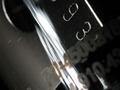
| 11/24/2002 08:59:00 AM |
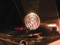
'Private Buckaroo' by Gene Autryby hedonistComment: Great photo of a bit older technology! Excellent lighting. I like the reflections on the metal. There's nothing bad I could say other than that the photo suffers from JPEG compression. When you look closely you can see the typical "atrifacts". Your photo is only only 28 kB big. Try saving in higher quality. You can use up to 150 kB for a photo on DPC. -stephan |
| 11/25/2002 09:27:00 AM |
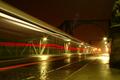
Linksby stephanComment: Thanks to everyone who commented. Nice to see that other people enjoy the photo, too. It wasn't an UFO ;-) The streaks of light come from a bus driving along the street. I chose the title (and think it fits to the challenge topic) because bridges are an important technology and always have been vital links between cities and people in general. The photo was only cropped and scaled. I did not do any heavy postprocessing to it. The colouring comes from the white balance I chose. I set it to "night" if I remember correctly and not to the one matching the lamps on the street. That's why the photo has this golden tint, which I like on this photo. I also did not sharpen it. The jagged edges come from the JPEG compression. I maxed out the quality to fit the 150 kB limit but it still was not enough. I still wonder why not more people complained about the lens flare created by the lamp to the upper right (not seen on the photo). This really annoyed me and I tried to get rid of it by going some steps backward and zooming more in, but it didn't help much. Also unfortunately there came no bus again. |
| 11/25/2002 05:11:00 AM |
City Traffic by ndsComment: My brother (nds) asked me to tell you that he's out of town until wednesday and won't be able to thank you personally. He'll do that as soon as he arrives. But I think I don't say something wrong when telling you that he's very very happy :-) |
 Photographer found comment helpful. Photographer found comment helpful. |
| 11/24/2002 08:46:00 AM |
City Trafficby ndsComment: Nice picture of someone elses art... no, no just kidding ;-) Great composition! I also like the colour tone. A bit overexposed, because the propellers disappear in the sky and the "nose" of the plane loses its edges. -stephan |
| Photographer found comment helpful. |
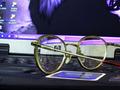
| 11/24/2002 12:26:00 PM |
...so I can see IT.by AntithesisComment: Nice idea! I like how the background is generally blurry but sharp when seen though the glasses. That's a creative concept and fits for this challenge perfectly. However, I think a different background would have worked better. Something simpler like the a page in a book. -stephan |
| 11/24/2002 06:58:00 PM |
keeping the way & waterby kenboComment: Nice angle. You had a good photographic eye to see this. But I would have cropped out the fence at the bottom of the photo. I also think the bird distracts from the whole scene which is more static and generally in good focus (which the bird is not). -stephan |
| Photographer found comment helpful. |
| 11/24/2002 10:08:00 AM |
Let there be UV lightby dadas115Comment: The photo looks very interesting, but I don't know what it is. But that doesn't matter much. It probably makes it that interesting _because_ I don't know what it is. ;-) -stephan |
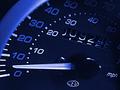
| 11/24/2002 09:52:00 AM |
Odometerby marboComment: I like the photo. Nice lighting, but it could use a bit more focus. -stephan |
| Photographer found comment helpful. |
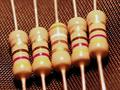
| 11/24/2002 12:35:00 PM |
Resistance Is Futileby ScottLComment: Nice macro! I like the background texture and the colours you used. Lighting is ok. The depth of field is a bit too narrow because the front parts of the resistors are blurry which looks a bit odd. A smaller aperture would have helped. Nice title ;-) -stephan |
Home -
Challenges -
Community -
League -
Photos -
Cameras -
Lenses -
Learn -
Help -
Terms of Use -
Privacy -
Top ^
DPChallenge, and website content and design, Copyright © 2001-2025 Challenging Technologies, LLC.
All digital photo copyrights belong to the photographers and may not be used without permission.
Current Server Time: 08/13/2025 09:36:17 PM EDT.