|
|
| Image |
Comment |
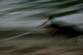
| 06/12/2007 05:55:17 AM | Racing for Breakfastby nolinesComment: I really can't see the painting with light aspect in this shot, and the subject is not clear.. If an image is predominantl blur or out of focus, you need either stron colour or contrast to hold the eye, or to have some aspect of the image sharper than the rest to hold attention... |
| 05/19/2007 06:31:28 AM | |  Photographer found comment helpful. Photographer found comment helpful. |
| 05/15/2007 06:23:09 AM | |
| 01/02/2007 04:17:16 AM | "Grab That Cash With Both Hands . . ." - Moneyby sammy_stecchinoComment: Greetings from the Critique club...
A self portrait.... Not only do I have to critique your photography, but I'm potentially going to insult you as well! Just my luck. :-).
Firstly the challenge; you met that well, and picked a cool song to boot, so no issues there.
Technically you've taken the photo well, the exposure is good with a nice range of tones in the skin and money, with no unduly distracting areas in that respect. Focus is bang on, you've got all of the important bits of the image inside the DOF and sharp.
Your lighting setup looks good, although I would have liked to see more modelling in the lights, having your brightest light slightly more off to one side, but that's a personal taste thing really. The shadows of your right hand on the shoulder are a little distracting if I were to be picky. A reflector (big lump of white card / white bed sheet / fancy-pancy studio reflector) to the right would have removed it, but in a self-portrait is often very difficult to see these things, and as I said, I'm being picky.
Your overall composition/cropping is a solid use of the principle of thirds. Pureists might argue that you've committed some wierd sin by chopping off the to of your head, but it works just fine in this case.
Without seeing the non selective desat version I can't say if you made the right choice on that, but there's nothing wrong with this version. Selective de-sat can be a bit over-used / abused at times, but you have enhanced your message by it's use so that isn't the case here.
Asthetically I don't find there is anything special about this photo. Without the title and the context of this challenge it certainly wouldn't be hanging on my wall, although it would be useful as a stock photo for sure.
I think to make it a 'keeper' from my point of view the expression on your face would have to be more, err, expressive. The look on your face is placid, sort of neutral, smiling for the camera. The wild eyed stare of a madman who had just grabbed 1,000,000 in cash would have been a much better fit to this theme. To me you're saying 'Look Mum, here's my Photo for your side-table, and oh, I've got some money too.
Thanks for sharing.... | | Photographer found comment helpful. |
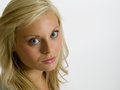
| 09/01/2006 07:45:59 PM | 0256 - recroppedby KevinRiggsComment: I think this is a nice portrait, but I find the small catchlights in her eyes really distracting for some reason...
When I do headshots I like to use a 60" octabox or 48" square box as close as I can get it for the fill/catch light.... Gives nice diffuse catchlights, although it might be a bit difficult in your case, I see you're already shooting at F/11, so I imagine you have the same problem I do with lights too powerful for filling sidelit headshots. (Must resist urge to buy more gear...)
The catchlights in image id 386973 are about as small as I'd have them, and that was a 40" brolly about 3 ft in front of my Daughter, but it's the key so I have it turned up a bit. (Must post some of my studio work on here).
To solve this problem for me I'm in the process of building a huge (8ftx6ft) scrim. Out of PVC pipe and white nylon.. Going to make some gobos for it that look like windows/trees/buildings and light it (bounce or through) as a fill for moody headshots... It's a good plan.. | | Photographer found comment helpful. |
| 07/07/2006 07:41:53 AM | |
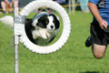
| 07/07/2006 07:26:31 AM | why....by otisXmikeComment: It's a pity your blood dosn't look red enough, almost looks like spagetti sauce. :-). Love to see how you got the vignette when the comments some up after voting. 7 | | Photographer found comment helpful. |
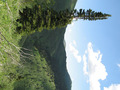
| 07/05/2006 06:41:49 AM | Mountain Hikeby AarthekComment: ! I'm sure I'm not the first to comment, but I hope you do really well for your literal interpretation of the no editing rules. 8 for me. :-) | | Photographer found comment helpful. |
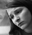
| 06/28/2006 05:16:20 AM | first day of summer vacation, and it's rainingby margiemuComment: Greetings from the Critique club.
What a great character study.
I'll start at the technical end, which to my mind is pretty much bang on, you're exposure is good on a contrasty subject, and the B&W conversoin is solid with a good range of tones in the skin and complimentary tones in the shoulder and most of the window.
Focus is good, and you've not been tempted to use the sharpening tools too much as many here on DPC seem to think is mandatory. Making this image tack sharp would have detracted from the wonderful expression on your models face.
I find the highlights on the hair at the top of the frame to be a little distracting, as is the light band showing through the window. Both pull me away from staring into the eyes of the model, where my attention should be. I would have been tempted to dodge/burn (darken, can never remember which is which) the stripe a bit, and maybe crop the top a little more to remove those distrations.
Cropping the top would give the girl a little more space to gaze into as well. I feel her vision is cramped a little.. By that I mean the image is taller than it is wide, and she's looking diagonally out of the frame.. Maybe slighty more of her reflection and less top would fix that? Probably just me. :-).
You've got some great compositional elements in here, by design or accident. Triangles are very strong 'anchors' for an image. The dark area of shoulder and hair is one, neck and jaw line, the eye-line cutting the image diagonally in half. Very solid elements...
As some others mentioned I think the title is maybe a little weak, which loosens the fit for the challenge a little, although I think it's a lovely photo outside the context of the challenge, and would probably have faired well in a different competition with the same title.
Great work, thanks for sharing..
Cheers, Chris Hellyar. | | Photographer found comment helpful. |
| 06/28/2006 05:02:29 AM | T H U N D E R H E A Dby NitinComment: Greetings from the critique club....
Cor, I don't even know what I'm looking at for sure. :-).
I'm assuming it's some kind of glass sculpture/bowl etc...
This is a very strong, almost abstract image, which imediately captures your attention, and makes be wonder what I'm looking at. Are the shadows in the front fingers holding some delecate artwork, or is this a large light fitting?
However, once I'm over the curiosity, and imediate impact of the image it dosn't hold my interest for much longer, as it's in essense a still life study of something I don't connect with or understand. Having some clues in the image as to what the viewer is looking at would help in that respect, or if it were part of a series which gave the hints as well.
I say almost abstract, but not enough that I can dwell in the pure shapes and tones of the pattern in the front of the object. The contrast of the dark surrounds pull me back out to the still life study again.
I'm not a fan of the dead-center composition, although I suspect you probably tried other angles with this subject and they may not have worked that well.
Technically you've got the focus good and exposure is what you'd expect with a centrally lit glass/plastic object. To do a better job in that sense a great deal of setup and messing about would be required...
Great to see you've gone out a limb with the voters here on DPC, many don't risk confusing the punters here with things that are difficult to explain.
Cheers, Chris Hellyar. | | Photographer found comment helpful. |
Home -
Challenges -
Community -
League -
Photos -
Cameras -
Lenses -
Learn -
Help -
Terms of Use -
Privacy -
Top ^
DPChallenge, and website content and design, Copyright © 2001-2025 Challenging Technologies, LLC.
All digital photo copyrights belong to the photographers and may not be used without permission.
Current Server Time: 08/01/2025 03:37:55 AM EDT.
|