| Image |
Comment |
| 04/05/2007 12:52:15 PM |
|
 Photographer found comment helpful. Photographer found comment helpful. |
| 04/05/2007 12:50:45 PM |
Un-Usedby UrfaKComment: How does this show fitness. Technically well shot though. |
| Photographer found comment helpful. |
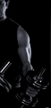
| 04/05/2007 12:47:16 PM |
Fitness? or Vanity?by LVicariComment: Fitness for using dumbbells, as I use them myself. But vanity
for taking a photo of oneself using said dumbbells. :-)
Okay, that was jealousy. My arms don't look that great yet.
IMO the dumbbell on the left side of the photo is distracting.
And also the lighting is a bit dark. Generally being on the dark
side is good to show definition of the arm, but having it a bit
brighter, will still show definition. B&W is an interesting choice.
Not bad or good. Color could have worked as well. I gave this a 6. |
| Photographer found comment helpful. |
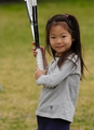
| 04/05/2007 12:38:22 PM |
Miss. Tennisby zuzhenComment: Is this adorable cutie playing on a grass court? :-)
As a tennis fan I may be a bit partial to this photo, but
this really is well shot. Blurring of the background is good
for DOF. Background also has no distracting objects to detract
attention from the main points of interest, her face and racket.
Photo isn't lessened IMO by not showing the top tip of the racket.
Main flaw I see is the focus is a bit soft. Also add a bit more
contrast. overall, a 7. |
| Photographer found comment helpful. |
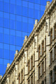
| 04/04/2007 04:18:20 PM |
Over Shadowed by Height Aloneby banmornComment: Fine overall, but IMHO an edge of the skyscraper could have been
shown, even if just a hint of it. Because it may look like a nice
glass design cut and pasted above the older building.
Focus is a bit soft as well.
Still, I like the lines and shapes in this one. And it does fit
the challenge theme. |
| Photographer found comment helpful. |
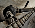
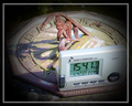
| 04/04/2007 04:10:42 PM |
v = 2.425by HeiSchComment: High marks for creativity and originality. Too many clocks, and common
electronic devices like cellphones in this challenge.
This composition is not exactly blurry, but the focus is a bit soft.
IMHO it needs to add a bit of sharpness and contrast. Lighting
is fine.
What looks like blonde straws on the side are very distracting
as well.
I really like your concept here, it just could have been better
executed. |
| Photographer found comment helpful. |
| 04/04/2007 04:00:42 PM |
Time After Timeby GreetmirComment: Idea is great. Execution not so great. Could be a bit
sharper and the placement of radio controlled device
not ideally placed. Maybe upper left, so I can view more of
the more interesting old fashioned clock. |
| Photographer found comment helpful. |
| 04/04/2007 03:55:34 PM |
|
| Photographer found comment helpful. |
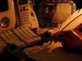
| 04/04/2007 03:50:00 PM |
My Dearest Langdon,by bdennyComment: Another Langdon birthday challenge? :-)
I like the quill pen, ink bottle, and the caligraphy writing
in contrast with the modern devices of today.
Interesting shade of sepia for the whole photo.
What about have the modern tools in color and the older
tools in black and white? This is advanced editing, so it's allowed.
Could be slightly sharper in focus.
Overall, I like the concept. Creative. |
| Photographer found comment helpful. |
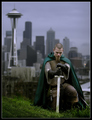
| 04/04/2007 03:39:13 PM |
Longing for Home by robaComment: Very nice concept, and great execution. Muted lighting is fine for
this composition. Good DOF with the skyscrapers blurred behind this
Medieval Man. Is he looking down because he's being knighted?
IMHO I still would have had him look towards the camera, with
a look of pride in his eyes.
Overall, I'd give this an 8 |
| Photographer found comment helpful. |
Home -
Challenges -
Community -
League -
Photos -
Cameras -
Lenses -
Learn -
Help -
Terms of Use -
Privacy -
Top ^
DPChallenge, and website content and design, Copyright © 2001-2025 Challenging Technologies, LLC.
All digital photo copyrights belong to the photographers and may not be used without permission.
Current Server Time: 08/25/2025 05:34:00 AM EDT.