| Image |
Comment |
| 09/20/2007 05:22:56 PM |
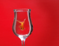
Goldfish Revisitedby sarrobiComment: Honestly...Ilike yours better. teh original is just too red for me. I likehow you have offset the red withthe glass. I like the greater deatin in the fish as well. |
 Photographer found comment helpful. Photographer found comment helpful. |
| 09/20/2007 05:21:30 PM |
|
| Photographer found comment helpful. |
| 09/20/2007 05:16:40 PM |
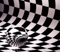
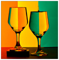
Bille II .. or IIIby ralphComment: I like your larger ball and larger reflection, but your whites seem to have a pinkish hue. |
| 09/20/2007 05:15:13 PM |
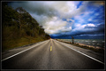
Into the Stormby shamerComment: Tough, tough choice. The original and the copy both rock.
I like the waves. |
| Photographer found comment helpful. |
| 09/20/2007 05:12:59 PM |
Evolve IIby ZeppKashComment: Tough choice on which is better...the original or your copy. Both are excellent. I'll give you the edge because I hate Sony. |
| Photographer found comment helpful. |
| 09/20/2007 05:10:48 PM |
Homage to Hughletherenby brownsmComment: A deja Vu of a deja Vu. Sweet.
Nice job on getting the drop. Your colors and lighting are very good, but Hugh edges you out on sharpness. |
| Photographer found comment helpful. |
| 09/20/2007 05:07:58 PM |
|
| Photographer found comment helpful. |
| 09/20/2007 05:06:22 PM |
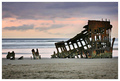
A Ships Demise - Tribute ala DrAchooby jenesisComment: Ilike the pinkish coloring better than Doc's blue, but I do prefer his high tide. he beats you in the sharpness category as well. This is a really nice shot in it's own right. |
| Photographer found comment helpful. |
| 09/20/2007 05:04:19 PM |
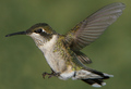
Bird In Flight (Speed II Challenge)by GolferDDSComment: In a way, i like your better. It more detailed and you've completely stopped the wings. I prefer teh lighting of the original.
I'm hanging a hummingbird feeder next year! |
| Photographer found comment helpful. |
| 09/20/2007 01:49:11 PM |
|
| Photographer found comment helpful. |
Home -
Challenges -
Community -
League -
Photos -
Cameras -
Lenses -
Learn -
Help -
Terms of Use -
Privacy -
Top ^
DPChallenge, and website content and design, Copyright © 2001-2025 Challenging Technologies, LLC.
All digital photo copyrights belong to the photographers and may not be used without permission.
Current Server Time: 08/27/2025 04:41:15 AM EDT.