| Image |
Comment |
| 10/25/2004 07:21:01 AM |
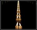
The Best Drinks are Blueby skylenComment: Most shots are not cropped tight enough -- the photographer just does not get close enough to the subject. Looking at this image, I think you have found an image that just the opposite is true -- I think this image is begging for more negative space above it and probably to one side or the other.
Great idea with wonderful lighting and colors.
David |
 Photographer found comment helpful. Photographer found comment helpful. |
| 10/25/2004 02:34:46 AM |
togethernessby gaurawaComment: A good image of a great idea. All in all, the centered composition, with the reflections going all the way to the top, draws the eye up out of the frame. Placing the mirrors so the reflections do not reach the top would have drawn into the frame and kept interest better.
Like LisaCan, there is something else not quite right that I'm having a hard time putting my finger on. It is perhaps the lack of emphasis in the image. A diagonal row of reflections would have produced more impact, but it may have taken from the tranquility that I think you were shooting for.
David |
| Photographer found comment helpful. |
| 10/25/2004 02:25:46 AM |
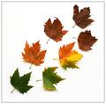
Journeyby gaurawaComment: I absolutely love this. The progression through life toward death is great.
David |
| Photographer found comment helpful. |
| 10/25/2004 02:23:16 AM |
Trioby gaurawaComment: This is a great image. Although it is for the backlight challenge, a bit more light on the center of the flower - just enough to keep it from shifting to black - would have enhanced it. But, I probably don't know what I'm talking about -- after all, it did place 12th. :D Congrats.
David |
| Photographer found comment helpful. |
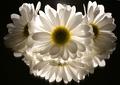
| 10/23/2004 05:57:02 AM |
daisy with shadow borderby gaurawaComment: Excellent use of shallow DOF. Looks great. If I had to find something that bugged me it would be the cropped petals and the oof forward petals ... but that would only be noticed if I had to find something. ;)
BTW: thanks for using this photo to demonstrate the border with ... I've found a new portfolio to visit when I have time this weekend.
David Message edited by author 2004-10-23 05:59:25. |
| Photographer found comment helpful. |
| 10/11/2004 03:48:17 AM |
|
| Photographer found comment helpful. |
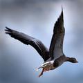
| 10/07/2004 05:24:50 AM |
Go Southby jonrComment: That is one brightly lit bird. I hope you didn't drink from the water he took off from. ;) |
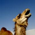
| 10/07/2004 05:22:55 AM |
I was fired by that cigarette company!by photomComment: I bet you are getting clobbered for it being a domesticated animal.
But not from me. My only problems with it is the large amount of negative space is throwing the composition off-balance. I would have been nice to see the eyes a bit lighter as well. |
| Photographer found comment helpful. |
| 10/06/2004 02:56:59 AM |
Some things are better left untoldby peeteComment: Naughty, naughty! ;)
The composition is good, and tells a story so well -- but the lighting is too flat binding the image without the contrast to hit the sweet spot. |
| Photographer found comment helpful. |
| 09/25/2004 02:49:48 PM |
Awaken Your Sensesby LokiComment: The effect works well, but there is (imo) too much lost to the darkness -- her left hand comes from nowhere, the flower is floating, etc. I'm thinking that if you moved slightly to your left the leg would have provided a much stronger diagonal than it does and the balance between light and dark would have been made more equal. As it is, the negative space on the right (her left) is not being used by the model and is not adding to the image. |
| Photographer found comment helpful. |
Home -
Challenges -
Community -
League -
Photos -
Cameras -
Lenses -
Learn -
Help -
Terms of Use -
Privacy -
Top ^
DPChallenge, and website content and design, Copyright © 2001-2025 Challenging Technologies, LLC.
All digital photo copyrights belong to the photographers and may not be used without permission.
Current Server Time: 07/30/2025 04:11:01 PM EDT.