| Image |
Comment |
| 07/14/2005 02:24:06 PM |
Paige.jpgby sheapodComment: This is very well exposed and loses no detail in the highlights and shadows. It doesn't use the entire range of tones however so moving the left and right sliders in the Level dialog helps -- and if done to each channel individually it also helps to remove the slightly green cast.
All in all, it is nicely done. |
 Photographer found comment helpful. Photographer found comment helpful. |
| 07/02/2005 04:45:16 PM |
11 going on 21by CalliopeKelComment: This is fabulous. The toning is perfect from the darkest shadows to the brightest whites (some might not think so about the flowers on her shirt, but I like them the way they are).
But, since you asked for suggestions, there are a couple of minor (very minor) items that I would take care of. The first is the small shiny spot on the tip of her nose -- a couple of hits with the burning tool will take care of that. The second are the multiple catchlights in her left eye -- there is only one in the right so I would clone out the extras, leaving what matches the one in the right.
Like I said, they are very minor, but on a shot this good the attention to these details are needed to give it just a bit more punch.
David |
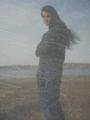
| 04/11/2005 02:57:15 PM |
Mourning Reflections in Graniteby theSajComment: The image is great, but just misses the mark of what you stated as your goal. I feel the goal of 'to capture the feel of those who remain behind in mourning' would have been better served if there was something in the frame to indicate it was a memorial/tombstone. Move the young lady a bit to the right and include any writings that may be there in the negative space on the left, and I for one would have seen your intention more clearly.
David |
| Photographer found comment helpful. |
| 02/05/2005 05:19:14 PM |
Light Raysby StagoleeComment: Nicely captured rays of light, but the contrast seems a bit flat. |
| Photographer found comment helpful. |
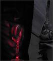
| 02/05/2005 05:11:31 PM |
Bled Dryby rblantonComment: The light, red reflections on the glass, are good; but the image is too dark. The details are all bunched up on the left-side of the histogram, and loses a lot of detail. I think it would have been better if you had not rotated the image as well. |
| Photographer found comment helpful. |
| 02/05/2005 05:04:53 PM |
|
| Photographer found comment helpful. |
| 02/05/2005 05:03:36 PM |
Liteby cabaComment: Great idea for the challange, and must have taken a lot of patience and practice to get it right. There are really only two things I find distracting about it; the letters are all bunched together, overlapping in some places and the weight of the image is too much off to one side, the left. |
| Photographer found comment helpful. |
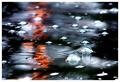
| 02/05/2005 04:59:54 PM |
There's Beauty In The Breakdownby sherComment: It meets the challenge well -- reflected light, bubbles lighter than water and a light ripple on the surface -- but the image is busy and I am not finding a definite subject to focus upon. |
| Photographer found comment helpful. |
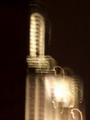
| 02/05/2005 04:54:20 PM |
Empire State Lightby suecunningComment: The points that I am sure you have heard already in the comments; image size is not using the allowed size of 640 pixels on a side and has a bit of a clockwise tilt. The motion blur is so obvious I will assume it was intentional, and it certainly brings the focus of the image away from the building (as a building) and places it squarely on the lights. A great way to meet the challenge topic head on. However, abstracting the building in this way leaves you with composition only to produce an effect -- and it is a bit heavy on the right hand side. The large bright area in the lower right out weights the rest of the image -- I believe placing more negative space on the right and less on the left would have produced a better composed image. |
| Photographer found comment helpful. |
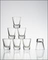
| 12/12/2004 10:34:56 PM |
Six Plus Oneby EddyGComment: Nice and simple, but I'm left wondering if you considered a landscape composition, with the single glass further from the center than the others. I think it would have balanced the composition without changing the image drastically -- that is, unless you wanted the image to appear tilted. :D
David |
Home -
Challenges -
Community -
League -
Photos -
Cameras -
Lenses -
Learn -
Prints! -
Help -
Terms of Use -
Privacy -
Top ^
DPChallenge, and website content and design, Copyright © 2001-2024 Challenging Technologies, LLC.
All digital photo copyrights belong to the photographers and may not be used without permission.
Current Server Time: 04/25/2024 01:38:22 AM EDT.