|
|
| Image |
Comment |
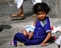
| 01/03/2006 05:26:59 AM | Sistersby PERCOMComment: After looking thru your BetterPhoto gallery I'm not so sure I should be the one giving the critique -- simply outstanding photos there. But, I drew the image, so I will give it a shot.
A vivid and bright image -- it is not surprising it gathered a lot of attention during voting with 3 favorites, 15 comments and a top 20% finish. There are a few reasons why I feel it placed as well as could be expected in the challenge though.
The bright sunlight served with two edges by giving enough light to use a shutter speed fast enough to stop the motion completely. This added to the vivid sharpness of the image, but also produced deep harsh shadows that had to be dealt with. You did a marvelous job of handing the light in selecting a moment to take the image when her face was not heavily shadowed.
Compositionally I feel a number of things hurt this image, the most noticable for me is that she is looking behind her, out of the frame. This pulls my attention heavily out of the image to the right and leaves the left 1/3 of the image unobserved. There is just nothing there but the background foot to balance the pull out of the frame. And while I'm speaking of the background, those feet (especially the leg coming out of her head) are quite distracting, and it would have been better to have waited until they were gone. This being a candid that may not have been possible, but they detract from the image just the same.
Her eyes are the biggest detraction from the image though (and I'm certain others will disagree with this), because they do not involve me as a viewer. It would have been welcome to have had a sense of interaction with the scene by involving her eyes within the frame.
In post-processing it seems to have been oversharpened just a bit (there are halos in a few places, mainly around her arm) and could have handled a bit less saturation (but that is heavily a matter of taste).
I feel the reception of this image in the challenge suffered further by the use of a relatively large depth of field. While it is small enough to include only the subject, it is not prominant enough to isolate the subject from the rest of the image. There is good seperation between the childs head and the background, but that seperation is lost most everywhere else.
Once again I enjoyed browsing your portfolio at BetterPhoto and was not surprised to see you praise Librodo's work in the comments you've made -- his influence is very evident in your own work. Wonderful work.
David
Critique Club Message edited by author 2006-01-03 06:29:15. |
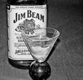
| 10/11/2005 07:24:57 AM | Nightcapby trtfeasorComment: Good take of the challenge -- and popular. The glass is positioned well in front of the bottle, and has the novelty of looking like an upside down night-cap. However, the image as a whole is left-heavy with too much negative space on the right with nothing to balance it except the seem running off the edge.
Technically, the exposure is good, with little being pushed out the top or bottom and the sharpness of the image could be used to etch the glass.
David
Critique Club |  Photographer found comment helpful. Photographer found comment helpful. |
| 10/11/2005 07:14:09 AM | A Little Pick Me Upby susanhComment: Sorry, but I don't find this image interesting -- the lighting is harsh and blowing out the shells, while the subject sits off in a corner and is only connected to the challenge by what it once contained.
The title cleverly plays on words sending the message to pick up the trash that is so carelessly tossed about -- but, unfortunately, this cleverness throws the subject away from the challenge by making it trash instead of a beverage.
David
Critique Club |
| 10/11/2005 06:43:17 AM | Bacoby lowonenergyComment: Good idea -- a nice relaxing drink of Coca-Cola by candlelight.
Unfortunately the subject (the drink) is far too dark. Not that there isn't enough light -- there is -- but the light sources (the candles) are both above the liquid line. The places the the entire beveragea in complete darkness. To combat this, either place the candles further away from the glass (which will drastically reduce the light on the subject) or light the subject discretely from some other source.
I like the choice of candles -- they add to the rustic relaxation. Brings to mind a night of sitting around a fire in a cabin or a lodge.
David
Critique Club | | Photographer found comment helpful. |
| 10/11/2005 06:07:33 AM | Overshadowedby kenaComment: The perspective hits the challenge head on, but including the sky in the frame made for a difficult exposure -- the sky is just too bright. Using a flash would have helped even out the tones to the point you may not have had to do so much post processing.
As stated in the comments, there is no sense of interaction between the flower and the person, making the person a bit of a distraction rather than a composition element. Having the person reaching for the flower, or some other interaction, would have helped with this.
Looking thru your entries I see that you have a lot of good ideas and are learning to express them well. Keep up the good work.
David
Critique Club |
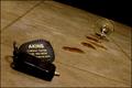
| 10/11/2005 05:44:51 AM | Don't drink and driveby NitinComment: I can see the fall -- stumbled on the way to the car, all bleary eyed (color cast) and dropped the keys and watched as the glass skidded across the floor spilling the last of your latest drink. The message is strong...
...Unfortunately it requires the viewer to read a lot into the image that simply isn't there without the title. Don't get me wrong, the composition that is here works -- the tilt of the tile and strong diagonal controlling the eye and giving a sense of being off-balance. But I feel it fails to provide a complete visual connection with the message -- which is likely what resulted in the lower than average score.
How to make it better? Well... Perhaps including more of the driving theme, such as placing the scene out on a driveway or street. Also, some portion or the person that took the spill could have been in the shot -- at least a hint of a presense, such as a shadow.
As it stands it is a good idea that was reasonably well executed -- but stands too much in isolation, relying on the title to prompt the viewer to fill in far too many gaps.
David
Critique Club | | Photographer found comment helpful. |
| 10/10/2005 07:29:10 AM | Drinks Chaosby spreComment: A good abstract of bright colors -- but perhaps a bit too busy. The bright colors keep my eyes moving, looking for a subject, something to focus my attention upon -- but I just can't find it.
The setup obviously took a great deal of attention to accomplish -- and since your intention was to represent a jumbled mess, I would have to say you succeeded with it.
Upper 5's for a score is very respectable -- especially for your first challenge entry. Good luck on your future entries and welcome to the site.
David
Critique Club | | Photographer found comment helpful. |
| 10/10/2005 07:18:49 AM | Bug's viewby ellulsComment: A very nice flower image -- taken from an unusual perspective, giving it more interest than the normal flower shot. The near perfect exposure is very nicely done and with a wonderfully executed depth of field.
The half-chewed petals are a distraction though -- one solution would have been to frame the image much tighter with the chewed portion just out of the frame.
The image sticks to the challenge theme well, but could have been stronger by showing more of the stem to provide a strong leading line moving the eye upward.
While I generally like softer flower shots, this isn't a general flower shot and I feel it would have benefitted from a bit more sharpeninging than it ihas. The is particularly true for the stem.
Nicely done.
David
Critique Club | | Photographer found comment helpful. |
| 10/10/2005 07:07:24 AM | God Loves Usby xylkeComment: Courages title to place on the image. I hope you weren't hit too hard by those not knowing the quote it came from.
I do agree with you, the composition could be better. However, it does have a srong leading diagonal (the bottle) going for it. If the opener had been leading to the corner instead of out the top I feel it would have been a bit stronger.
But the composition isn't my biggest worry here. The image just has way too much contrast for my taste. The bottle is quite a bit underexposed while the background is glaringly overexposed. Exposing for the bottle (perhaps stopped down a small amount) would have kept the white background, but allowed the bottle and opener to be better represented. This stark dynamic range is aceented even more by the sharpening done. The end result is a photo that is more 'edgy' than I like.
David
Critique Club | | Photographer found comment helpful. |
| 10/10/2005 06:52:42 AM | Sweetby rbennyComment: Nicely composed -- with wonderful use of natural light.
However, as the commenters mentioned it is a bit underexposed with some of the detail on the left side of the bottle being lost. A reflector (or brightening the shadows in post-processing) helps a lot.
The only glaringly obvious 'flaw' that I would have handled differently is the tear or scratch on the bottles label, just above the 'I' in Baileys. It would be tempting to leave something like that to be cloned out in post-processing -- but when in a basic editing challenge such as this, that is not allowed. The quick and easy fix would require a couple of colored markers to paint the colors back into the tear.
As I said, an excellent study of classic composition that works nicely and fits perfectly within the challenge.
David
Critique Club |
Home -
Challenges -
Community -
League -
Photos -
Cameras -
Lenses -
Learn -
Prints! -
Help -
Terms of Use -
Privacy -
Top ^
DPChallenge, and website content and design, Copyright © 2001-2024 Challenging Technologies, LLC.
All digital photo copyrights belong to the photographers and may not be used without permission.
Current Server Time: 04/15/2024 11:56:59 PM EDT.
|