| Image |
Comment |
| 07/04/2004 07:16:02 PM |
Relaxing pose between two shotsby menardmamComment: Lighting: The face is well lit, but the overhead lighting begs for a reflector below to soften the harsh shadows under her chin and jaw.
Pose: The over all pose is fine, but the viewpoint is a bit too high. Also, having her eyes closed (or looking at something below) is not as expressive as it could have been.
Background: The black background was well done, but I would like more separation around the har. |
 Photographer found comment helpful. Photographer found comment helpful. |
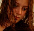
| 07/04/2004 07:12:03 PM |
My Loveby Thousands_FallComment: Lighting: Evenly lit, but with a slight cast and no catchlight to give the eyes some expression.
Pose: Works, but the motion blue is distracting. A soft focus would have worked better.
Background: Her hair is the main element of the background and works well.
Sorry, but this looks more like a quick snapshot of her after a shower than a planned and posed portrait. |
| 07/04/2004 07:08:19 PM |
Carmela Violaby johnmComment: Lighting: is harsh and has a color cast.
Pose: very unflattering with a DOF that is too shallow.
Background: distracting.
I realize the effect was intentional, but it does not convey the feeling that it has captured anything about the individual. |
| Photographer found comment helpful. |
| 07/04/2004 07:05:58 PM |
Send in the Clownsby Prime_TimeComment: Lighting: Even though the tone of this portrait is dark and moody, the backlight is working very well to give a solid separation. I realize the mood was desired, but I think it went too far. The eyes are by far too dark and very little distinction in the paint around the mouth.
Pose: Well suited for the desired effect, although I am sure you will get counted off for the landscape crop.
Background: Works well for the intended mood. |
| Photographer found comment helpful. |
| 07/04/2004 07:01:09 PM |
Black & White on Colorby DJLubaComment: Lighting: The lighting is a bit harsh, and it shows in the heavy contrasts (especially in the skin tones).
Pose: Pose is good, but the expression is not working with it for me. I would not have cut her right hand off with the crop.
Background: is clutttered. |
| Photographer found comment helpful. |
| 07/04/2004 06:59:12 PM |
Daydreamby labudsComment: Lighting: Very good, but could have used a reflector under her chin and more of a catchlight to highlight those wonderful blue eyes even more.
Pose: Works well for the desired result, but would have been more flattering if taken from a perspective just about eye level.
Background: No complaints; it does not really add anything to the image, but does not detract from it either, and it does have good separation from the similarly colored shirt. |
| 07/04/2004 03:43:59 PM |
Amyby sagestudioComment: Lighting: Works.
Pose: Classic but not over-done. Could have possible been better with a slightly above eye level perspective.
Background: Works, but while it does not conflict with the subject, it does not compliment either.
The image is suffering from noise that could have been cleaned up. Also, since this is an advanced challenge, smoothing out her skin tones would have made a more flattering portrait. |
| Photographer found comment helpful. |
| 07/04/2004 03:00:09 PM |
Going to the Chapelby crabappl3Comment: Lighting: The lighting works well, but the catchlight could be stronger. The sky in the background could be less hot, but I get the impression this was the effect you were after and it works well.
Pose: Wonderful. First thoughts were that she needed to be not slouching in the shoulders, but it works to give a feel of anticipation and nervous excitement.
Background: Perfect for the mood, but the bushes to make it a bit cluttered. |
| 07/04/2004 02:54:56 PM |
Low-Key Rembrant Lightby JoelHSmithComment: Lighting: The lighting is great.
Pose: Works well, but the stare is unsettling.
Background: well toned, but would be less distracting if more OOF. |
| Photographer found comment helpful. |
| 07/04/2004 02:52:46 PM |
My Little Angelby briphotoComment: Lighting: Well lit, but seems a tiny bit over-exposed. There are a few places in the hat that have lost detail.
Pose: Wonderful, my only suggestion would be to have her look up a bit more.
Background: Works well with the model and outfit, but could have been a bit further back to diminish the shadow. |
Home -
Challenges -
Community -
League -
Photos -
Cameras -
Lenses -
Learn -
Help -
Terms of Use -
Privacy -
Top ^
DPChallenge, and website content and design, Copyright © 2001-2025 Challenging Technologies, LLC.
All digital photo copyrights belong to the photographers and may not be used without permission.
Current Server Time: 08/04/2025 08:46:04 PM EDT.