| Image |
Comment |
| 07/04/2004 10:22:25 PM |
The Moon Studioby WildpurpleComment: Lighting: way too harsh with just a touch of a color cast.
Pose: I do not care for the stare.
Background: n/a |
 Photographer found comment helpful. Photographer found comment helpful. |
| 07/04/2004 10:21:14 PM |
Innocenceby mariomelComment: Lighting: well balanced with a good catchlight.
Pose: works well.
Background: Works, but there needs to be more separation between the hair and the background. |
| Photographer found comment helpful. |
| 07/04/2004 10:19:40 PM |
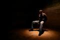
Hostageby BeagleboyComment: First I like this photo, added to my favorites, but just not as a portrait.
Lighting: The most expressive part of the person is the face, and it is hidden in shadows.
Pose: Not really very expressive of the person.
Background: works well. |
| Photographer found comment helpful. |
| 07/04/2004 10:16:30 PM |
Kellyby TallblokeComment: Lighting: Good, with expressive catchlights, but would have been better with a reflector bouncing the light back up from below to soften the shadows.
Pose: she just jumps right out and says 'hi' doesn't she. I would have place her face more toward the upper-left third and not cut off her arm.
Background: very busy, with not enough separation between the black shirt and the dark spots in the background. |
| 07/04/2004 10:14:05 PM |
Brideby grigrigirlComment: Lighting: perfect, although it appears a bit overprocessed to the point of her skin looking at bit plastic.
Pose: is not quite as expressive as I would have liked, particularly the stare, but it works well. Also, since this is under the advanced editing rules, the tan line should have been burned to match the rest of her skin.
Background: works well, but I wish it was not tilted. |
| 07/04/2004 10:10:39 PM |
Annaby heidaComment: Lighting: Nicely done, but is a bit too dark on the right and you lost detail in her hair for it.
Pose: works well.
Background: compliments the portrait nicely. |
| Photographer found comment helpful. |
| 07/04/2004 10:09:04 PM |
Save a Horse, Ride a Cowboyby L1Comment: Lighting: The light is fairly even, but could be more so. The catchlight in the eyes is nice.
Pose: His expression could be better, but it is fine. The shallow DOF works well here. I would have preferred a little less processing on the skin, it is looking a bit plastic.
Background: The folds a bit distracting, but not overly so. I would have liked to see more separation on his right, however. |
| Photographer found comment helpful. |
| 07/04/2004 10:08:45 PM |
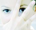
Her eyesby MiinervaComment: Lighting: Well done high-key. But that is exactly why the reflections in her eyes are so distracting, particularly the reflection of you in her right eye.
Pose: works well.
Background: nice. |
| Photographer found comment helpful. |
| 07/04/2004 10:03:35 PM |
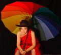
Lady in redby asijComment: Lighting: even and nicely done, although there are a few places that would have been better if it was not quite so hot.
Pose: works well, but I would have preferred the hair not be across her eye.
Background: The black background is well done, but there needs to be more seperation between it and the umbrella. |
| Photographer found comment helpful. |
| 07/04/2004 09:58:54 PM |
Me and Myselfby artvetComment: Lighting: The light is even, but there seems to be a color cast. A catchlight would have helped I think.
Pose: Not very expressive.
Background: the black works. |
| Photographer found comment helpful. |
Home -
Challenges -
Community -
League -
Photos -
Cameras -
Lenses -
Learn -
Help -
Terms of Use -
Privacy -
Top ^
DPChallenge, and website content and design, Copyright © 2001-2025 Challenging Technologies, LLC.
All digital photo copyrights belong to the photographers and may not be used without permission.
Current Server Time: 08/02/2025 06:55:07 AM EDT.