| Image |
Comment |
| 06/03/2002 11:01:00 AM |
Grevy on a Sundayby PatellaComment: NIce composition. I would have given this a 10 if the focus had been on the eye rather than the hide. (I imagine this is the AF feature at work.) Nice tonal range, Maybe jst a touch flat, looks like its about 8 zones, 9 zones would add a bit. |
| 06/03/2002 10:57:00 AM |
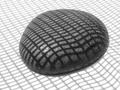
grid rockby lecookComment: Well done. I like the tonal range. The whte seems to be just a few % below the highlight on the rock. I the composition would feel better for me with a bit more space on the left and the top, right a bottom equal. (bottom is a bit too much.) Another alternative would be more space at the top with right and bottom equal. One criterian I use for B&W is if I would rather see the image with color. This image passes that test easilly, color would be a distraction. |
| 06/03/2002 11:04:00 AM |
Fixer-upperby MrsKroComment: NIce image, I would have given it a 10 if the composition were better. The slant seems careless rather than compositional. Nice tonal range with the highlight on the knob plate and the deep shadow behind the door. Composition would also have been helped with the door know a bit higher. |
| 06/03/2002 10:51:00 AM |
Untitledby iraeComment: Great candid portraint. the highlights in the eyes and lower lip are just right -right at the top of the tonal range. The dynamic range is well controlled. I like the sharp detail in the hat with the soft "glow" in the skin. NIce cropping as well. Well done. |
 Photographer found comment helpful. Photographer found comment helpful. |
| 06/03/2002 11:07:00 AM |
Capturedby CountComment: Just a little sharper and this would get a 10 from me. I like the grainy look. (I'm assuming you accomplished that without violating the rules) This is one instance where washed out highlights and featureless shadow work. Nice cropping as well. It works well. Good job. |
| 06/03/2002 10:48:00 AM |
Not a care in the world...by geekmediaComment: This is a great candid moment. And, the image has good dynamic range with a nice catch light in the eye. I also like the tight cropping. Just enough sharpness in the eyes, while the rest of the image has a "baby" softness. That is hard with a digital camera, well done. |
| 06/03/2002 11:13:00 AM |
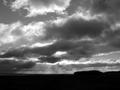
stormy weatherby snowComment: If this had a flat or more interesting horizon it'd get a 10. The "lump" on the right causes just enough distraction to take the edge off for me. Seems to make the image just a little too right heavy. NIce tonal range in the clouds, ski and light "rays". This is also a good example to illustrate that the horizon does not have to be at a third. |
| 06/02/2002 11:29:00 PM |
April in May by connieComment: This would have been much better if you had been able to keep some detail in the highlights. It would still have been possible to have the light airy mood. I like the tight cropping around the face. The lighter area with hair strands behind the head is distracting, the crop could have eleminated that without unbalancing the image. |
| 06/02/2002 11:35:00 PM |
Leavingby GordonComment: The sharp tile and blurred man indicatge this was taken at a slow shutter speed. That is the down fall, this would be a much more compelling image if the man were sharp. also, the light on the floor creates a visual pull away from the man. |
| 06/02/2002 11:51:00 PM |
Day Dreamer by MrsKroComment: This is a nice image of the girl, the soft lighting on the face, flowing to the shadow on the right. The unsettling element is the view outside the window. It is distriacting and visually out of caracter with the expression on the girl's face. My guess is that this was a posed or at least a set up situation. Even if it were just eliminating the "stick" -probably the edge of a chair back on the porch- would help. Using the minimum DoF would also have helped. |
Home -
Challenges -
Community -
League -
Photos -
Cameras -
Lenses -
Learn -
Help -
Terms of Use -
Privacy -
Top ^
DPChallenge, and website content and design, Copyright © 2001-2026 Challenging Technologies, LLC.
All digital photo copyrights belong to the photographers and may not be used without permission.
Current Server Time: 06/28/2026 08:21:06 PM EDT.