|
|
|
Showing 161 - 170 of ~689 |
| Image |
Comment |
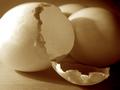
| 08/13/2002 07:07:00 PM | New Life or New Omelette?by annelizabethComment: Very original theme, among my favorites for this challenge. I like the lighting angle very much, but do note that the light is a bit strong and harsh enough to blow out detail from the upper left of the egg. Consider this setup as an alternative: A multi-flash setup with a well diffused key light from the left and a fill-in from above the camera set two or three stops below the key light. |
| 08/13/2002 08:36:00 PM | Tiny Toesby aguerraComment: This is really a nice composition with good lighting. However, there appears to be a problem that probably resulted from the resizing. The outline of the image (toes, legs, etc.) have a terrible amount of digital artifacts that are probably from the jpeg compression. I say this because the file size is much smaller than allowed by the challenge rules. Most image editing programs allow you to set the amount of compression when saving as a jpeg file. I'm going to more or less overlook this problem, but I would like to share my view that with digital photography, competence with post processing can be almost as important as competence with the camera. It isn't much different than having good darkroom skills when working with film. |
| 08/13/2002 06:55:00 PM | |
| 08/13/2002 08:44:00 PM | My New Toyby courtenay27Comment: Hope to see some great shots from your new toy. Good composition, but it would be nice to have gotten a bit more light to pull out detail from the dark camera body. |
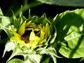
| 08/13/2002 07:33:00 PM | growing in the windby FranziskaLangComment: Very interesting effect, and without PhotoShop! This is one of my favorites for this challenge. I find it original and very well done. The colors are very saturated, but that seems to add to the almost surreal look of the photo. The background is great, I would like to know how you achieved it. The composition is just right, almost too tight, but I like that it brings the viewer close in, which is especially important when dealing with the small format required by the challenge. Very good job (10) |  Photographer found comment helpful. Photographer found comment helpful. |
| 08/13/2002 07:00:00 PM | Coming Up Rosesby daysezComment: The deep color reminds me of Fujicolor film. Nice balance composition. My one nitpick is that I think the green background is almost too much and tends to compete a little with the subject. I think that a solid background (white paper) might help isolate the subject. How's this look when printed? |
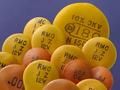
| 08/13/2002 07:11:00 PM | Capacitors In Bloomby jkiolbasaComment: I think these are the dipped ceramic bliss variety, colorful yet very hardy and suitable for year-round planting. I like the arrangement. It doesn't excite me, but it is very well done in terms of balance, composition, color, exposure, and focus. |
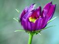
| 08/13/2002 07:38:00 PM | Tomorrow's Salty Snackby BigSmilesComment: This is a good composition and an interesting subject, but the lighting is just too harsh. I find that the blown out highlights are very distractive. I think that a bit of fill flash might work for a situation such as this. It would be nice to have just enough fill to allow stopping down and to illuminate the inside of the bud, but not so much as to eliminate the shadows. |
| 08/13/2002 07:35:00 PM | Out with the old, in with the newby DazzermasComment: I like the brush in the background. It is visible, yet subdued enough that it isn't a distraction. The highlights on the glass are a bit of a distraction. Overall a very good effort on this shot. |
| 08/13/2002 06:41:00 PM | A Bright Futureby titotapadoComment: Here is my honest response to this photo. I am not certain which is the subject, the car or the girl. I will assume that it is the girl, since the car will only degenerate from this point on. She is a nice subject with a great smile and hopefully a bright future, but she is not exposed well enough to really see her. The image is composed such that she hasn't fully entered the frame, which might be okay except that the background is so distracting that it dominates and becomes forground, which I presume you don't want. There may be a relationship between the girl and the car, but I don't have any visual clues to indicate that this is so, which leaves me wondering why the image is composed with the car so dominating the frame. |
|
Showing 161 - 170 of ~689 |
Home -
Challenges -
Community -
League -
Photos -
Cameras -
Lenses -
Learn -
Help -
Terms of Use -
Privacy -
Top ^
DPChallenge, and website content and design, Copyright © 2001-2025 Challenging Technologies, LLC.
All digital photo copyrights belong to the photographers and may not be used without permission.
Current Server Time: 08/09/2025 07:03:48 PM EDT.
|