| Author | Thread |
Comments Made During the Challenge  |
|
|
08/18/2002 08:49:00 PM |
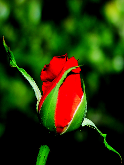
Nice but just not spectacular enough to rate higher than =6 syamjonimi
of course this is just a personal opinion....... |
|
|
|
08/18/2002 01:33:00 PM |
|
For me, the red seems a bit overpowering. |
|
|
|
08/18/2002 12:12:00 PM |
|
This is getting the highest score of all the new flower pics from me. Its a little too contrasty. but really good. |
|
|
|
08/16/2002 11:17:00 PM |
|
You know, at first, the rose looked like it was cut and pasted onto the background. The strange outline on the top of the bud made me think this. However, As I was trying to shoot a photo for the pencil challenge, I came upon the same strange black outline in one of my photos that I had taken too close to the computer screen. I definately get the newness in the photo and it is a beautiful rose. Looks like you played with the colors a bit. The red looks unnaturally too red, however, the same thing creating the mystery black outline may be causing the redness to also be off. I like the angle and closeness of the rose and I like how it's lit and the background is far off. Nice photo, good luck in the challenge. |
|
|
|
08/16/2002 04:08:00 PM |
|
Too many "flower" shots in this challenge, but there are some good ones. I like the detail and focus on the rosebud, and the colors are great, but the blurry background is distracting... to me anyway. I would have dropped it closer I guess. |
|
|
|
08/16/2002 12:29:00 PM |
|
|
|
08/16/2002 11:00:00 AM |
|
i love the shape of the rose with those leaves pointing up and down in opposite directions. i would like to see more texture in the red of the rose. -- gr8photos (7) |
|
|
|
08/16/2002 07:12:00 AM |
|
I love the high contrast in this. The colours are beautiful and vibrant. There's something about the composition that makes this rose seem as though it just "sproinged" out of the ground like that plant in the BC comics :). It has a kind of joyous look to it. |
|
|
|
08/15/2002 08:51:00 PM |
|
The red is washed out. Where's the texture? |
|
|
|
08/15/2002 04:47:00 PM |
|
Reminds me of Mapplethorpe in color. just a little more depthe would have made this one ideal, but the focus goes soft just on the center leaf. Also, I may have cropped to allow both the raised and lowered leaves to run off the corners this would have hidden the tiny diseased end on the left. Otherwise excellent marks - 9 |
|
|
|
08/15/2002 01:33:00 PM |
|
The colors seem unreal in this photo, and the frontal light gives the bud a flat appearance. |
|
|
|
08/15/2002 10:43:00 AM |
I would think that most people would agree that this is way too oversaturated. You're losing a lot of detail in the petals by saturating the colors this much. Plus, I would probably try to frame it differently. The two leaves branching off to either side are a little distracting with the rose being framed so tightly.
Score: 3
Courtenay |
|
|
|
08/15/2002 09:04:00 AM |
|
The colour is so rich it seems to be creating a smudged look. Perhaps a really sharp image with a little less contrast would have worked better... |
|
|
|
08/15/2002 06:16:00 AM |
|
|
|
08/14/2002 10:24:00 PM |
|
I almost submitted a shot just like this - Terry Gee |
|
|
|
08/14/2002 08:03:00 PM |
|
I find the lighting much too harsh to do the flower justice - especially the black shadow at the top of the stem. |
|
|
|
08/14/2002 02:56:00 PM |
|
Great shot, I like the background a lot. However, the red looks a little too saturated - something fixed in photoshop, perhaps? |
|
|
|
08/14/2002 12:27:00 PM |
|
Not sure I like the saturation on the red. The green I like, but the red overpowers it. |
|
|
|
08/14/2002 11:38:00 AM |
|
I like the contrast of colors. |
|
|
|
08/14/2002 08:08:00 AM |
|
ug too much contrast and saturation |
|
|
|
08/14/2002 07:05:00 AM |
this is a wow...
everything is perfect
|
|
|
|
08/14/2002 06:59:00 AM |
|
Great light and DOF. :) Nice job. |
|
|
|
08/14/2002 06:32:00 AM |
|
I especially enjoyed this shot. Very nice. The isolation of the subject with the control of the depth of field makes it work for me. Thank you for submitting it. 10 Morgan |
|
|
|
08/13/2002 10:45:00 PM |
|
Nice flower, but I think the colours are a bit off...the background shouldn't be so dark. |
|
|
|
08/13/2002 08:54:00 PM |
Composition5
Technical Aspects4
Appeal4
Creativity4
Rating4Autool
|
|
|
|
08/13/2002 07:00:00 PM |
|
The deep color reminds me of Fujicolor film. Nice balance composition. My one nitpick is that I think the green background is almost too much and tends to compete a little with the subject. I think that a solid background (white paper) might help isolate the subject. How's this look when printed? |
|
|
|
08/13/2002 06:24:00 PM |
Something new.
Composition - quite good. What is yellow area on lower right of bud?
Technical Aspects - quite good
Meets Challenge - yes
Visual Impact / Originality – quite good
Jim msp
|
|
|
|
08/13/2002 03:49:00 PM |
|
Personally I think there is too much contrast in this image, I think you over cooked the levels adjustment slightly? tomlewis1980 |
|
|
|
08/13/2002 01:42:00 PM |
Wishing you were allowed non traditional ratios. Would like to crop just above upper leaf so leaves make diagonal across whole photo.
6, Kavey |
|
|
|
08/13/2002 12:44:00 AM |
|
I liked the contrast of the green and res it looks really nice! And the sharpness of the close up is really good, nice shot! |
|
|
|
08/12/2002 11:42:00 PM |
|
excellent lighting. Very dramatic. |
|
|
|
08/12/2002 10:03:00 PM |
|
like the saturation effect |
|
|
|
08/12/2002 08:58:00 PM |
|
It is beautiful but the colors and contrast seem a little too harsh.. |
|
|
|
08/12/2002 02:42:00 PM |
|
Mind your focus! With a shot like this, it is usually the front/middle of the flower that gets the focus, not the back. |
|
|
|
08/12/2002 12:17:00 PM |
|
Nice contrast, although it's not quite in total focus. |
|
|
|
08/12/2002 12:07:00 PM |
|
nice but too contrasted... |
|
|
|
08/12/2002 09:15:00 AM |
|
Colors are beautiful, but almost too much of a close-up. |
|
|
|
08/12/2002 12:42:00 AM |
|
i love pics of colorful flowers, good composion and saturation of color. |
|
Home -
Challenges -
Community -
League -
Photos -
Cameras -
Lenses -
Learn -
Help -
Terms of Use -
Privacy -
Top ^
DPChallenge, and website content and design, Copyright © 2001-2026 Challenging Technologies, LLC.
All digital photo copyrights belong to the photographers and may not be used without permission.
Current Server Time: 06/28/2026 02:04:49 PM EDT.