#3 Vaseby
SonifoComment: Originally posted by Sonifo:
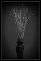
Hey guys..I noticed a lot of positive comments on all the shots, which is way cool, but I would suspect that some real honest opinions would really help people get better even on mine. What I see in my shot is going to be totally different that what the public eye sees. Don't be afraid to give me a honest comment and I hope you don't get upset if I give mine. I will try to give it in the nicest way possible. |
What a lead in but sadly can't go to town on this Soni :(
so, general nit pickings from my dark monitor...
I'd have preferred the black of the frame to be the same width on all sides.
Not overly happy with the white in the border not being white in the top and bottom.
Whilst I see the vignette works well here I'd like to see less of it as its cutting into the subject.
Off centre has been covered below but is the vase tilting to the right ever so slightly?
I'd like to see a little more seperation twixt the vase and background and some more light on the front of the vase.
Going back to the off centre reply you made I think if you removed the 'twig' that curves to the right you could centre the vase without upsetting the general composition BUT, that 'twig' really helps the overall image so guess it remains off centre ;)
Simple subject, simple setup, simple lighting, simple (read basic) editing,
SIMPLY lovely image.
Now, you'd best stay on your best form Soni or the quote that started this comment will be back to bight you ;)