| Image |
Comment |
| 08/19/2009 05:02:21 PM |
The Pelican Brief - John Grishamby CitadelComment: Greetings from Andi via the Critique Club
First Impression: My first thought when I saw this challenge was that its a free study with provided shoehorn (book title). This is a nice bright capture of the pelican taken at just the right moment. I like the small blown out areas of the water and their 'sparkle' though others might think it was oversharpened?
Composition: A strong composition with the Pelican landing into the image from top right with the right amount of foreground space for him to end up in.
Subject: Unless anybody made up a book title this was really a free study so yes, met the challenge well, obviuosly the title meant you had to use a Pelican but they are birds I've only ever seen at the zoo so thanks for showing it :)
Technical: For me this ended up at around the right sort of score, what stopped it from scoring a 6+ average was the detail in the bird, the black seem to lack detail and whilst there is detail in the white areas its a little blown in places. Was his beak that colour or should it have been more like his legs? I'm thinking this was taken in strong sunlight.
Final thoughts: A nice shot, met the challenge well with good stopped motion and interesting water. Sadly let down in the main by the harsh lighting imho. |
 Photographer found comment helpful. Photographer found comment helpful. |
| 08/18/2009 05:51:13 PM |
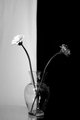
D i v i d eby VivaLaAlexanderComment: Greetings from Andi via the Critique Club
First Impression: This type of shot is a dpc classic, something I've not personally tried but imagine its more difficult to get that than most imagine? I think you (in your comments) and the commenters all hit the nail on the head - excellent idea but poorly executed (sounds like many of my challenge submissions lol).
Composition: If your going for a central subject then make sure its central, the vase and background split isn't central and the image isn't straight. A pair of scissors to get the flowers the same height would have helped the symmetry here.
Subject: At first glance I didn't get the dead flower/live flower intention and whilst yes, this meets the challenge maybe an older flowerhead would have worked better and even a couple of petals on the base?
Technical: You mentioned the creases on the left side of the background and overexposed flower so your thinking of how to do this better (thats good). For this to have worked better you need a white background, focus is a little soft and the left half of the image is a little noisy.
Final thoughts: A good idea for the challenge and I'll leave you with a personal challenge, please try and reshoot this image with a stark black and white background, central and straight with the flowers at the same height ;) |
| Photographer found comment helpful. |
| 08/18/2009 05:22:20 PM |
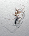
YUM NUM NUM NUM...by drphotos-dmComment: Greetings from Andi via the Critique Club
First Impression: Looks like a last minute 'oh, theres a spider eating a moth, that will do for the life and death challenge' type shot?
Composition:The composition is quite good with the spider nicely off centre and its shadow filling the lower part of the frame.
Subject:Yup, meets the challenge well though am guessing this shot wasn't appealing to a;ll the spider haters.
Technical: Sadly, this is the area that lets this image down, the lighting is uneven, casting poor shadows and the image looks flat to me though not sure a simple contrast boost would lift it enough. Nothing is in sharp focus here, the closet bits are the hairs on the leftmost leg.
Final thoughts: I hate using the term 'snapshot' on challenge submissions but thats what I feel here. That said I can't seem to get a good result from these critters. I know this was a serendipitous moment but for challenge entries you need to take more care about the setup/lighting/composition etc. On a lighter note if you'd left your apartment to shoot your free study shot without seeing this little guy you'd have forgotten your camera :) |
| 08/18/2009 02:13:26 PM |
The magnificent Lagoon nebula in Sagittariusby PascalComment: Greetings from Andi via the Critique Club
First Impression: An image I'm pretty sure I'll never take in my lifetime so kudos to you for capturing this. Whilst I'm pretty sure this would be well received by astronomers its not something that WOW's me
Composition: The compososition is fine and there is something to look at throughout the image.
Subject: As I mentioned astronamy is not high on my list (in fact I'm waiting for somebody to pick up an old telescope I used once, several years ago). That said I'm sure this appealed to lots of voters as it is certainly a different shot for us.
Technical: Hard to comment on the technicals and I'm sure this is an impressive shot within its field so again, well done.
Final thoughts: The more I look at this image the more I'm drawn to it and the more I'm seeing. First impressions can often be wrong and I'm warming to this so thanks for showing it to us all. |
| Photographer found comment helpful. |
| 08/17/2009 06:34:18 PM |
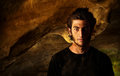
Portrait of a Young Man in a Caveby zackdezonComment: Greetings from Andi via the Critique Club
First Impression: I hate the title with a passion and truly don't understand why people title images like this? Why, oh why didn't you use something like 'Cave Man'? that said this is a stonking portrait and as a few commenters pointed out its more of a portrait shot than a cave shot.
Composition: Spot on, the subject is nicely composed on the right of the frame and you view past his right shoulder into the depths of the cave.
Subject: The challenge topic is caves/tunnels but this is more of a portrait of somebody in a cave and the cave is secondary to the subject in this shot. Of course it meets the challenge but not as well as many submissions.
Technical: Absolutely brilliant imho, as a portrait this is stunning, the lighting is spot on and I love just having half of his face in good light. The placement of your model and level of focus are also just right - a good job.
Final thoughts: I gave this a 6 during voting and tbh thought you would have finished a couple of tenths over 6 but am guessing I, like many felt the cave was secondary to the overall image? I need to be careful here (being a bloke) but going back to my thought of titling this Cave Man I think he should have taken his shirt off (it would have saved him getting mud over his t-shirt as well). |
| Photographer found comment helpful. |
| 08/17/2009 04:43:34 PM |
|
| Photographer found comment helpful. |
| 08/17/2009 01:30:58 PM |
Eye of the Tunnelby posthumousComment: Greetings from Andi via the Critique Club.
This is much easier to comment on post challenge than it would have been whilst voting was ongoing, why? because if this image was created intentionally then it could be deemed 'Art' but if it was taken as a 'serious' attempt at getting a sharp image and submitted for a laugh or an attempt at the brown then it fails to impress. That little statement could open up an entire debate as to when/how people see 'Art' and I'm sure everybody would be right as 'Art' is subjective, its just that I would prefer to know that what I'm looking at is a serious image (or am I falling for The Emperor's New Clothes ruse lol)
First Impression: I saw the eye in the thumbnail and was pleasantly suprised when I opened up the full size image. Its quite compelling when viewed for more than a moment and can imagine 'real' Critics extolling their wisdom whilst explaining the meaning behind this.
Composition: My initial thought was this would hold up well as a central image however you are probably drawn into the centre of the eye with this composition, all those converging lines are great.
Subject: Yup, its a tunnel so fits the challenge well, its also an eye so you can add 'tunnel vision'. Sadly DPC are not quite ready or willing to accept this sort of photography so I commend you for keeping up the good work.
Technical: Not an image to be technically critiqued as this has nothing to do with 'how' you shot it but the 'why' and 'what', its something to view without thinking about light, sharpness, grain, focus or other elements that tend to make up a more acceptable image.
Final thoughts: I'm so glad I drew another of your images for critique as they really are worth viewing for longer than the 2-5 seconds I'm sure most people spend on the average submission. You need to flip the image horizontally cos  skewsme skewsme is driving on the wrong side of the road! Keep them coming Don and give yourself a posthumous ribbon for this. |
| Photographer found comment helpful. |
| 08/16/2009 04:12:08 PM |
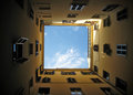
roman courtyardsby DoubledizzleComment: Greetings from Andi via the Critique Club and congratulations on this top ten image!
First Impression: A well exposed sky and you did a decent job of exposing the rest of the shot though its still a little dark at the edges for me.
Composition: Considering the planter being in the way I think you did a great job of composing this shot but it looks as if it could do with being rotated half a degree to the left.
Subject: Fits the challenge well though it doesn't 'WOW' me (I gave it a 6 btw). Now, if there was a low flying aeroplane dead centre this would have ribboned :)
Technical: My only thought on the technical quality of this shot is maybe some light shadow/highlight or equivalent during post processing to get a little more details at the edges but, after saying that maybe it works better as it is.
Final thoughts: A great shot for the challenge. Maybe you could have squeezed most of this into a square crop? I love the shutters at various staged of being opened/closed. |
| 08/13/2009 04:55:14 PM |
Energy Squaredby posthumousComment: Greetings from Andi via the Critique Club
First Impression: Didn't have you down for shooting this Don however I did think that rather than a shot at the brown this was more about making a statement and guess you suceeded ;)
Composition: I like your composition, a nicely filled frame with something to look at where ever your eyes fall.
Subject: I've looked at this for a little while now and been counting the 'implied' or part squares and tbh for me it actually fits the challenge topic well
Technical: Good exposure and focus apart from the ropes that look a little blown out for me and would have preferred some more detail in them though am guessing its white nylon in which case even properly exposed they would appear blown.
Final thoughts: Brown Ribbon material? maybe if it was posted in the circles challenge. No, it was never going to score highly but a 3.7 was undeserved imho and kudos for thinking out of the square! |
| Photographer found comment helpful. |
| 08/13/2009 04:20:26 PM |
Round...and Good for Youby danculwellComment: Greetings from Andi via the Critique Club
First Impression: Not the best of the bunch but its nice and colourful
Composition:It looks like a very simple setup but at least you took the time to arrange the fruit on a mirror. Its all a bit too central for me and would have preferred either the entire reflection or non at all
Subject: I like the fact that the circles are implied by the almost round fruit but am guessing most of the voters clipped you a point for dnmc in their opinions
Technical: You mentioned the light was a bit harsh so maybe diffusing the light with some cloth or similar and using a longer exposure might have helped? this would be a good setup for a light tent. Focus is ok but not as sharp as you'd need to score well (the orange has the best focus and lighting for me). Depending on the monitor I view this on the background can look ok however would look much better further away from the subject and not all creased.
Final thoughts: As you mention in your comments there are issues here however, with a little time and thought I'm sure you could reshoot this and make it a much better image (I do think 4.7 was a little harsh mind you). |
| Photographer found comment helpful. |
Home -
Challenges -
Community -
League -
Photos -
Cameras -
Lenses -
Learn -
Help -
Terms of Use -
Privacy -
Top ^
DPChallenge, and website content and design, Copyright © 2001-2025 Challenging Technologies, LLC.
All digital photo copyrights belong to the photographers and may not be used without permission.
Current Server Time: 08/08/2025 09:06:17 PM EDT.