| Author | Thread |
|
|
08/18/2009 05:51:13 PM |
Greetings from Andi via the Critique Club
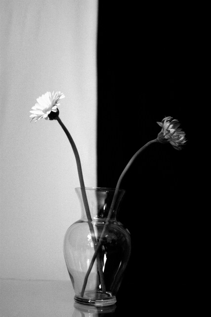
First Impression: This type of shot is a dpc classic, something I've not personally tried but imagine its more difficult to get that than most imagine? I think you (in your comments) and the commenters all hit the nail on the head - excellent idea but poorly executed (sounds like many of my challenge submissions lol).
Composition: If your going for a central subject then make sure its central, the vase and background split isn't central and the image isn't straight. A pair of scissors to get the flowers the same height would have helped the symmetry here.
Subject: At first glance I didn't get the dead flower/live flower intention and whilst yes, this meets the challenge maybe an older flowerhead would have worked better and even a couple of petals on the base?
Technical: You mentioned the creases on the left side of the background and overexposed flower so your thinking of how to do this better (thats good). For this to have worked better you need a white background, focus is a little soft and the left half of the image is a little noisy.
Final thoughts: A good idea for the challenge and I'll leave you with a personal challenge, please try and reshoot this image with a stark black and white background, central and straight with the flowers at the same height ;) |
|
 Photographer found comment helpful. Photographer found comment helpful. |
Comments Made During the Challenge  |
|
|
07/31/2009 10:39:45 AM |
|
a bi tilted, but I love the concept |
|
|
|
07/30/2009 09:31:44 PM |
|
I really this shot, I wish it was just a little more in focus |
|
|
|
07/30/2009 07:27:53 PM |
|
I think to pull this off effectively you need a clean white/black background and a super sharp image. |
|
|
|
07/30/2009 08:41:59 AM |
|
Not a bad representation. Not very clear though. |
|
|
|
07/29/2009 09:56:48 PM |
|
|
|
07/29/2009 04:55:10 PM |
|
I really love where you were going with it. It would be fun to see this shot with more symetry in the flowers and a square crop. |
|
Home -
Challenges -
Community -
League -
Photos -
Cameras -
Lenses -
Learn -
Help -
Terms of Use -
Privacy -
Top ^
DPChallenge, and website content and design, Copyright © 2001-2026 Challenging Technologies, LLC.
All digital photo copyrights belong to the photographers and may not be used without permission.
Current Server Time: 06/30/2026 12:44:54 PM EDT.