| Image |
Comment |
| 09/07/2007 12:40:38 PM |
|
 Photographer found comment helpful. Photographer found comment helpful. |
| 09/07/2007 12:40:34 PM |
|
| Photographer found comment helpful. |
| 09/07/2007 12:40:28 PM |
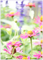
Aloneby beamsclanComment: I keep coming back to this. I love the simplicity of color and composition but it's the clearly stated idea behind the image that makes it. Beautifully done! |
| Photographer found comment helpful. |
| 09/07/2007 12:40:21 PM |
|
| Photographer found comment helpful. |
| 09/07/2007 12:40:14 PM |
Rowby roby21112Comment: Superb! Wonderful composition! I think the ring of light at the end of the one paddle makes this...like a diamond on a pretty girl! |
| Photographer found comment helpful. |
| 09/07/2007 12:40:07 PM |
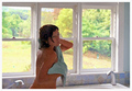
Après le bainby annigComment: How perfect can it get?! Neatly lit. Love the pose...very emotive! |
| Photographer found comment helpful. |
| 08/31/2007 01:09:12 PM |
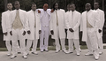
The Men: Wings For The Groomby 777STANComment: Greetings from the Critique Club!
An interesting collection of men. Their similar dress makes their postures and expressions more evident allowing the viewer to see their unique expressions and individuality.
I like the sepia toning in the majority of the image. Clearly you felt the need to make the groom stand out, and he does, but not in a good way. The difference in his complexion from the others just seems weird. I think his central position and difference of stance are enough to identify him as the main figure in this group.
It does look a lot like a shot of a musical group...I like the casual feel of this posed image. But as a posed image it seems that some better choices could have been made. The lighting is harsh leading to squinted eyes and uncomfortable expressions...especially on the man at the far right. The 3rd man from the right partially obscures the 4th...this merger weakens the whole. Large groups are difficult to get everything right, granted. So more shots to get a decent expression on everyone, eyes and faces generally in tune with the camera (not closed or looking out of frame), and avoiding awkward overlapping.
The background is relatively neutral, but the reflections off the water are not helpful and the concrete not so interesting. Compositionally, I think the frame is a bit tight at the top...a little more head room would help bring the faces more into the frame. The way this is cropped the outfits become the pattern feature...and that's interesting...but I think there is more interest to be found in the faces which are crowding toward the top of the frame.
As for the challenge, I rarely care when making these critiques but not being familiar with the term "wingmen" I have to agree with the comment that it would have made a better title in helping connect with the challenge topic. Otherwise, it just feels like a shoe-in.
Keep shooting! |
| Photographer found comment helpful. |
| 08/31/2007 12:27:49 PM |
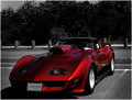
Downforceby RulerZigzagComment: Greetings from the Critique Club!
I have to be perfectly honest up front, car shots do little for me. I tend to regard them slightly lower than photos of sculptures because, in my mind, they are simply representations of other people's art. As such, the photographer needs to bring his own interpretation to the object...or create a believable "product shot"...I don't see much "interpretation" here, so let me comment from the commercial point of view.
The background isn't very interesting, it's clearly a parking lot. The choice of selective desat helps minimize the impact of the background but finding a different point of view to actually lessen the amount of image space taken up by the background might have been more effective.
The focal point seems to be somewhere around the left, front quarterpanel. At least that's where contrast and line is most interesting. Because the eye goes there I have to agree with the comment that the inspection and registration stickers and, subsequently, the brightly lit portion of car seat become distractions.
The lighting is bright which makes the shadows deep. I think you've lost too much detail in the lower left corner of the image. Showing off the car, IMO, means balancing detail and form...the shadows send the balance askew. The bright light and mirror finish of the car also picks up the odd reflection of the parking lot lines. Reflections and the size of the object makes autos difficult subjects to pull off.
Overall, this is an subject that makes car-lovers go Ooooh! I'm sure I would have stopped to look it over if I were passing by. But what I wish is that images of cars would make me see the "Ooooh!" when I look at them. Capture the feeling you get when you find a sexy Vette and then you'll have something impressive.
Keep shooting! |
| Photographer found comment helpful. |
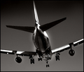
| 08/31/2007 12:07:08 PM |
m e t a l i c aby hotpastaComment: Greetings from the Critique Club!
First impression: good graphic impact! I like the tones...feels like a traditional black and white. The sky is odd...over-polarized?
Having read your comments I must agree with those who dislike the glow around the jet...it looks like a result of post-processing. It's very evident and doesn't seem to have an interpretation to it...it won't pass for water vapor. The jaggies are also clearly evident and take away from the smoothness of the metallic body.
The composition is probably the strongest element here. The timing of the shot, with the landing gear down, takes this a notch above the standard plane shot. I like the interpretation of the subject and agree with the comment that B&W is a satisfying choice.
Overall, it could be a cleaner image but the graphic impact helps make a statement of power and beauty. You predicted your score well...so what can I tell you except "Nicely done." |
| Photographer found comment helpful. |
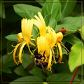
| 08/31/2007 11:51:14 AM |
Bee Wings & Honeysuckleby bs-photosComment: Greetings from the Critique Club!
This is a pleasant image to encounter! I like the realistic feeling of the colors...saturated, yes, but believable. The bee makes the image...lucky he flew in just in time for the shot!
The composition is satisfying. There's not too much or too little of anything in that regard. I especially like the way the shapes of the petal echo the shapes of the bee's wings. Nice repetition in this image to help the viewer stay with it longer.
The frame was a good idea because it helps contain the image stopping the eye from wandering out of frame. But I do think it's a little over done. IMO, the frame becomes a feature because of its color and 3-D quality...simpler would be better.
Generally I think the technicals are well handled. Good focus and sharpness. Nice DOF. The only feature (other than the frame) that I find distracting are the red stem and the reddish older blossom. Perhaps a little selective desaturation along the red channel would tone those items down and keep the subjects foremost.
I think the relationship to the challenge topic is fair. The wings really aren't the subject here. I agree with the comment that a bit of fill light might enhance the challenge subject. Or, if the bee had cooperated for a while, you might have chosen a lower angle of view to bring the wings further into the frame.
Overall, a pleasing shot with few detractions.
Keep shooting! |
| Photographer found comment helpful. |
Home -
Challenges -
Community -
League -
Photos -
Cameras -
Lenses -
Learn -
Help -
Terms of Use -
Privacy -
Top ^
DPChallenge, and website content and design, Copyright © 2001-2025 Challenging Technologies, LLC.
All digital photo copyrights belong to the photographers and may not be used without permission.
Current Server Time: 08/24/2025 07:39:58 PM EDT.