| Image |
Comment |
| 06/06/2004 11:33:29 AM |
America's Favorite Pass-time by hgpayneComment: Clean lines. Crisp! I like the geometry of the pattern in this picture. The duo-tone adds a nice twist to the modern setting. Well done! Good luck! |
 Photographer found comment helpful. Photographer found comment helpful. |
| 06/06/2004 07:55:17 AM |
|
| Photographer found comment helpful. |
| 06/06/2004 07:53:10 AM |
Rowingby RUEDISCHMUTZComment: Very nice! Love the lines of the oars, they pull the composition together so well! A little over-bright on my monitor--would like more contrast overall, but especially in the background trees in the middle of the frame. Well chosen subject! Good luck! |
| 06/06/2004 07:47:57 AM |
|
| Photographer found comment helpful. |
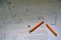
| 06/06/2004 07:32:17 AM |
Takes 5 Brave Men To Do My Algorithms HWby gpgeminiComment: On it's own this is an interesting photo--conveys frustration well with the broken pencil. Compositionis nice, like the color and placement of the pencil. With the title this represents more of a team "effort" than a team "sport", without the title it is an interesting picture that could be applied to many situations.... |
| 06/04/2004 03:03:49 PM |
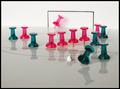
Backham Strikes Againby boogieComment: Funny and creative answer to the challenge! Effective use of limited depth of field, though perhaps if the "soccer ball" were in focus it would help. Love the reflections, the colors, etc. Fine job! |
| 06/03/2004 01:12:38 PM |
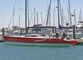
Racing yacht without the crew.by jimsappComment: A nice idea for this challenge. Perhaps a more limited depth of field would make the numerous masts recede and therefor enhance your subject. Still, a step above snapshot. |
| 06/03/2004 01:01:33 PM |
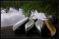
Canoeingby MonaComment: Beautiful pic. Nicely cropped. Good color depth. But as canoeing cannot fit the team sport aspect of the challenge, I cannot give you highest marks. I do believe this would make a nice print, though. |
| Photographer found comment helpful. |
| 05/29/2004 09:34:25 AM |
Tatty's yellow clothby undieyatchComment: This is beautiful! Like your poetic title, too. I like the way this is lit. Seems it would be better with a little more cropping from the bottom and left, as is it feels a bit off balance. |
| 05/29/2004 09:31:25 AM |
|
| Photographer found comment helpful. |
Home -
Challenges -
Community -
League -
Photos -
Cameras -
Lenses -
Learn -
Help -
Terms of Use -
Privacy -
Top ^
DPChallenge, and website content and design, Copyright © 2001-2025 Challenging Technologies, LLC.
All digital photo copyrights belong to the photographers and may not be used without permission.
Current Server Time: 08/25/2025 04:40:01 PM EDT.