| Image |
Comment |
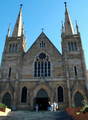
| 05/15/2006 08:41:30 PM |
ST MARY.Sby harleyComment: Because you weren't quite centred compared to the building the image is skewed - notice how one steeple is closer to the top of the image than the other. Since it's almost perfectly straight on, I would have went for as much symettry as possible and squared things up. |
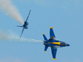
| 05/15/2006 08:39:52 PM |
Holy Coordinates of the "Right Stuff"by d95vetteComment: Great photo, but I'm sure your score will suffer because you tried to fit this image into the Holy Places challenge. Just don't think the score you receive is a true reflection of the quality of the image. |
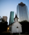
| 05/15/2006 03:53:21 AM |
Small Church in the Big Cityby scarbrdComment: Nice use of the large buildings to frame the church - the contrast is very effective. The building tops have quite a halo to them - is this a gaussian blur or the result of camera shake? It's a little distracting. |
 Photographer found comment helpful. Photographer found comment helpful. |
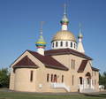
| 05/15/2006 03:51:57 AM |
THREE CROSSESby CONRADComment: As well as some perspective distortion (ie: top of building is narrower than bottom) - which I don't really mind - this image looks a little rotated. Perhaps its just the distortion tricking my eyes though. Also, a little sharpening in an image editor would really bring this shot to life. |
| 05/15/2006 03:48:44 AM |
quiet sanctuaryby saintaugustComment: Looks like a lovely building but, whilst this shot is different, it's an awkward composition. Do I look at the tree that dominates or the building behind it. Other than that, colour and exposure look great. |
| Photographer found comment helpful. |
| 05/15/2006 03:47:06 AM |
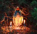
Immaculate Spaceby jneriaComment: I love the rich colouring, and the green branches around the top frame the subject nicely. |
| 05/10/2006 01:31:28 AM |
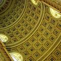
Cathedral Ceilingby banmornComment: I like your choice of orientation / perspective - its something quite different for this type of ceiling shot. |
| Photographer found comment helpful. |
| 05/10/2006 01:30:53 AM |
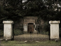
19th Century Cryptby TitiaComment: Unfortunately the pillars are so bright and dominant that they detract from the crypt itself a little. Perhaps a different view / perspective could have been chosen to make the image more interesting. |
| 05/10/2006 01:29:38 AM |
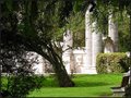
Heavenly Gardenby BosborneComment: Sorry - this looks a like like a case of trying to use a title to make the image fit a challenge. Ignoring that, its a great photo that I'm sure would look good blown up on canvas. You'll suffer for not really meeting the challenge in the eyes of a lot of people though so don't think the score reflects the quality of the photo in general. |
| Photographer found comment helpful. |
| 05/10/2006 01:26:45 AM |
(Angel of the North.) Englandby judojoeComment: The image is great although the border (in my opinion) does nothing to add to the picture and would probably be better left out. The simplicity of colour and shape really make the picture easy to look at and the people give the statue a lovely sense of scale. |
| Photographer found comment helpful. |
Home -
Challenges -
Community -
League -
Photos -
Cameras -
Lenses -
Learn -
Help -
Terms of Use -
Privacy -
Top ^
DPChallenge, and website content and design, Copyright © 2001-2025 Challenging Technologies, LLC.
All digital photo copyrights belong to the photographers and may not be used without permission.
Current Server Time: 08/12/2025 09:00:11 AM EDT.