| Image |
Comment |
| 09/15/2004 05:18:41 AM |
Fruit 'n Rocksby dr rickComment: hey there. great job. It turned out really well with a nice composition. It is interesting why you included both rocks and fruit but i think it works quite well. I am not sure you would need rocks in the title though, i think it could be interesting to not say there are rocks there, then let people wonder what type of fruit they are. Great color and contrast. There seems to be dark black, whites and a nice mid-range... good job.
-from the critique club. |
 Photographer found comment helpful. Photographer found comment helpful. |
| 09/13/2004 03:53:24 AM |
private momentsby pcodyComment: interesting, and good job fining something interesting in a mundane place. i am not sure if this image will end up high in the placements but i think it should do better than it will. |
| Photographer found comment helpful. |
| 09/13/2004 03:52:16 AM |
|
| Photographer found comment helpful. |
| 05/26/2004 01:06:39 AM |
Does anybody have a quarter?by rubyrednailsComment: great idea, not as good execution. window light would have been much better than the bulb, or flourescent or flash you used, and a background that was unrecognizable... like a sheet far away, or a white paper, or black paper, or anything... the blanket doesn't really add.. or well.. it detracts. |
| 05/03/2004 02:10:49 PM |
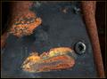
Rust Paintingsby KaveyComment: wellll,... this must be an outtake from the rust challenge...
doesn't fit this challenge then
how could it.... i hope i don't see it again on tuesday...
haha..
just kidding
great image... i givya an
eight |
| Photographer found comment helpful. |
| 05/03/2004 02:18:35 AM |
|
| Photographer found comment helpful. |
| 04/30/2004 12:21:46 AM |
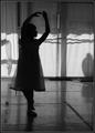
School of Danceby MJENNIComment: nice shot. I really like the cropping in this image. i think the contrast could use a little bumping though. it seems a bit low, I can't find any real white in the image.. just a dull grey. I don't know if it was purposful (i guess i should assume it is) but i think i like the shadow of the ballerina leg in the background,.. it provides a nice contrast to the young girl. nice pose, and i like the profile of the face. It gives the image a little more feeling... i think the shadows on the back wall work well as well (excpet for those two strong lines going horizontal).
good job.
-from the critique club. |
| 04/30/2004 12:19:24 AM |
The Future...by scwortmanComment: interesting shot, and fairly interesting. I am not sure if this one benefits from being centered or not. i think there is too much going on in the direct center and then nothing for the rest of the picture. it doesn't keep my eye moving, and thus i won't look at the image very long. perhaps if the people were to the side with the sun on the other side... using the rule of thirds for placement. Perhaps if the poeple were walking it would provide a little more interest. Decent shot though, decently exposed, and a good start of an idea.
-from the critique club. |
| 04/30/2004 12:17:20 AM |
Kruegerby soccerdadComment: nice image. hmm just thinknig about what could be improved. i wonder if the elephant could be just a TOUCH more in focus. it seems soft right now and might be improved by being very sharp. Perhaps the fact that is looks a little fake (the mouth) makes it seems less impressive, but you have a great idea and a good start. The sunset behind the elephant is good, with nice reds and steaks of darker and lighter shades. I like the cropping and framing of the image.
-from the critique club. |
| Photographer found comment helpful. |
| 04/29/2004 02:24:40 AM |
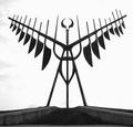
Kempenfelt Shadowby ColeyComment: I am looking for some black in this image an don't see any. I would say it is a little over exposed.
I really like the point of view you used. it draws my eye into the image.. with a very striking image of a sculpture. I am not sure it it produces a whole lot more though,... more than a good picture of the sculpture... but that is an allright thing too, if that is what you are looking for.
keep up the good work.
-from the critique club |
Home -
Challenges -
Community -
League -
Photos -
Cameras -
Lenses -
Learn -
Help -
Terms of Use -
Privacy -
Top ^
DPChallenge, and website content and design, Copyright © 2001-2025 Challenging Technologies, LLC.
All digital photo copyrights belong to the photographers and may not be used without permission.
Current Server Time: 08/27/2025 12:45:40 AM EDT.