| Author | Thread |
|
|
04/30/2004 12:19:24 AM |
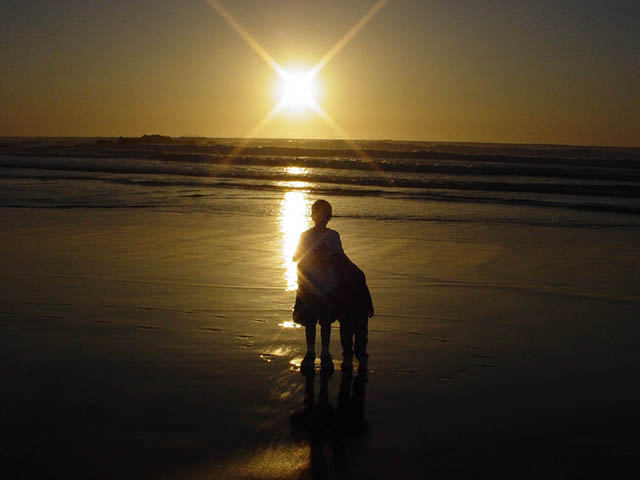
interesting shot, and fairly interesting. I am not sure if this one benefits from being centered or not. i think there is too much going on in the direct center and then nothing for the rest of the picture. it doesn't keep my eye moving, and thus i won't look at the image very long. perhaps if the people were to the side with the sun on the other side... using the rule of thirds for placement. Perhaps if the poeple were walking it would provide a little more interest. Decent shot though, decently exposed, and a good start of an idea.
-from the critique club. |
|
Comments Made During the Challenge  |
|
|
04/25/2004 10:27:51 PM |
|
Your image had / has great potential. THe problem for me is, I'm having a hard time making out part of the silhouette. I can't tell if they are facing front or back or, where the child on the right side's head has gone? :-) It's a nice silhouette, with nice sunset colors. If you could do it again, I'd try to work on making sure both children's heads are visible against the sun in the back. |
|
|
|
04/25/2004 05:00:38 PM |
|
Nice shot of what appears to be a great sunset!. My guess is that you'll receive comments on the centering, but I guess I'll add another one; too centered. Also the star reflection in the water / sand takes away a bit of the silhouette. Perhaps it would have been better with it edited away? |
|
|
|
04/24/2004 10:25:06 PM |
|
I love the golden cast here. The horizon seems a bit tilted, but this is still a wonderful image. 9 |
|
|
|
04/22/2004 05:13:50 PM |
|
I think you were on the right track here. If I can offer a little advice, I would have shot this from a little lower and had the reflected sun directly behind the subjects. Also I would have had the two children stand seperate and holding hands instead. The reason I say this is that it almost looks like it is one child with 4 legs (not really, but you know what I'm getting at).... and perhaps shot it a little tighter, lifted the contrast a little more to make it more of a shilouette and a little more saturation. I hope this helps. Good Luck, Todd. 6. |
|
|
|
04/22/2004 03:44:28 AM |
|
I like the colors and the reflected light source, but I think it would have worked better if not centered. |
|
|
|
04/21/2004 04:42:33 PM |
|
Great beach shot. I think the people could be a little more silhouetted (like the model on the left wearing a darker t-shrirt) but it doesn't matter that much. I also think it would be cool if they were facing the sunset, which I can't tell if they are or not. Horizon seems slightly tilted. This is only my opinion on minor detail. Overall it is a great shot. 7 |
|
|
|
04/21/2004 04:36:25 PM |
|
Sea photos are always great for Silhouettes |
|
|
|
04/21/2004 11:25:39 AM |
|
hmmm...some advice. :-) Great shot, buuuut did you try to take the photo with the kids in the rule of thirds area? Might be better for the composition. Maybe even get down and take it to the right/back of them to stil achieve the effect of the sun. Not sure...good luck. Very nice! |
|
|
|
04/21/2004 01:03:30 AM |
|
This is lovely but too centered....still an 8! |
|
|
|
04/20/2004 11:19:21 PM |
|
I like this for the fact that there is some color in it. Many of te images in this challenge are so stark, black against white. |
|
|
|
04/19/2004 10:55:01 PM |
Very cool photo.....nice one.
I think it may look better without the sun spot beneath the kids....but I do like it. |
|
|
|
04/19/2004 02:12:40 PM |
|
Great interaction between the two models. Way too centered, try placing the sun in nearly the top left corner (leave a bit of breathing room.) |
|
|
|
04/19/2004 08:57:06 AM |
|
hard to see the figure on the right so it looks like one subject with 4 legs. Suggest that you move one of your subjects (sun, figures) off of center to add additional interest to the composition |
|
Home -
Challenges -
Community -
League -
Photos -
Cameras -
Lenses -
Learn -
Help -
Terms of Use -
Privacy -
Top ^
DPChallenge, and website content and design, Copyright © 2001-2026 Challenging Technologies, LLC.
All digital photo copyrights belong to the photographers and may not be used without permission.
Current Server Time: 06/28/2026 06:29:43 AM EDT.