| Image |
Comment |
| 01/19/2005 07:05:20 AM |
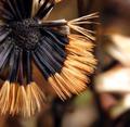
Winter gardenby lytaComment: i like this image.
I think the bokeh in the background strengthens the plant in the foreround. It has a similar shape. I wonder if the bokeh on the right side of the image is a little bright for my liking, taking a bit too much attention away from the rest of the photo. You have great detail in the front flower, which creates good interest. Perhaps i would have enjoyed to see a larger crop.. a little more of the flower on the left and a little larger bokeh area... .. but those are just my opinions...
great image.
-from the critique club- |
 Photographer found comment helpful. Photographer found comment helpful. |
| 01/19/2005 07:02:50 AM |
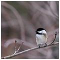
Out of the Thicket by BeagleboyComment: ohh.. lucky me... I get the first place image to critique :)
well.. first off, congrats on a winning image.. obiously it is well done.
so...
good use of thirds, having the bird in the bottom right corner, looking up and too the left creates a very strong image. The branch entering in the bottom left corner leads the eye to the bird, making it a pleasing image to look at. The tree's in the background create a very simple and pleasing bokeh with very natural, organice lines, nicely contrasting the sharp image of the bird.
good job.. I also like how you didn't crop any more of the photo.. i like that the bird takes up only a small portion of the frame. |
| Photographer found comment helpful. |
| 01/18/2005 04:40:42 PM |
Enjoy the Viewby AlbireoComment: I like the abstract image of architecture. I think architecture really lends itself well to abrtract images. My complaints, I think the space left on the left and side is too small. I would like either there to be no space or more.. this little space creats a trap for my eye which it can't get out of.. The same goes for the top of the image...
Otherwise, the things i enjoy about this photo. I like the repetition of the vertical lines of the front building as well as the reflection of the building behind. I think the lightened wall of the rear building is also very important to this shot. It gives it some contrast.
-from the critique club-
|
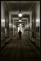
| 01/18/2005 04:32:18 PM |
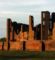
Kenilworth Castleby JamesterComment: well congrats on your first submission, let me be the first to give you an official critique from the critique club.
The castle seems a little out of focus, which is too bad, or perhaps the image in general is a bit soft... however you used a very small aperature so focus shouldn't have been much of a problem... did you have a large zoom on the lens?... anyhow putting that aside, the picture has very interesting light, I think this helped with your score. The person on the edge is well placed in the frame. I like how the castle plays with the sky, using the windows to show the sky through, as well as on the left side of the photo where the sky comes down to the grass.
congrats on a decent first score. |
| Photographer found comment helpful. |
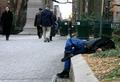
| 01/18/2005 04:26:47 PM |
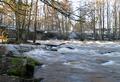
Where is the hidden photographer?by HoddssonComment: An ok image... however it lacks interest for me. It is very busy. My eye isn't lead anywhere really, and has nothing to rest on. To improve this shot, perhaps you could have used something like depth of field to reduce the things to look at, or having something more prominant in the forground, the rocks on the left are hinting towards this idea, but they are not large enough to much attention. I also find that taking a photo in total shade very seldom produces interesting results... it is nice to have lights and darks in a photo.. |
| 01/18/2005 04:19:32 PM |
|
| Photographer found comment helpful. |
| 01/13/2005 01:53:02 PM |
|
| Photographer found comment helpful. |
| 01/11/2005 04:04:15 PM |
Ignoredby BeagleboyComment: hey there... this was one of my fav's.... 10 great shot. |
| Photographer found comment helpful. |
| 01/04/2005 11:46:54 AM |
Restingby oksamitComment: i wonder if this is oslo... same garbage cans in any case... |
| Photographer found comment helpful. |
| 01/04/2005 04:31:49 AM |
Bestefarby samtrundleComment: er du norsk eller?.. fin bilde, bra bruk av negative space.. kunne likt a ha mer contrast. |
| Photographer found comment helpful. |
Home -
Challenges -
Community -
League -
Photos -
Cameras -
Lenses -
Learn -
Help -
Terms of Use -
Privacy -
Top ^
DPChallenge, and website content and design, Copyright © 2001-2025 Challenging Technologies, LLC.
All digital photo copyrights belong to the photographers and may not be used without permission.
Current Server Time: 08/26/2025 05:02:04 PM EDT.