| Image |
Comment |
| 05/21/2004 07:22:01 AM |
Looking for foodby ingvarComment: Nice colors, nice composition. Don't like the DOF though: the background should be either sharp or more out of focus, as it is now it draws my attention away from the bird. 6 |
 Photographer found comment helpful. Photographer found comment helpful. |
| 05/20/2004 01:15:40 PM |
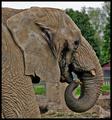
Up Close & Personalby browntComment: * From the Critique Club *
I like this image a lot. You captured the texture of his skin extremely well, it's all sharp. Framing is good, I like the way his head and trunk fill the frame. The only thing that's bothering me a little bit is that the background almost blends in with his chin, that part of his head does not really stand out against the background. More blurring of the background might have improved that (but I realize you're already at the largest opening of this lens), or choosing a different standpoint. I'm not too fond of such a wide border as you have used here, but that's a personal thing.
Congrats on a nice image! |
| Photographer found comment helpful. |
| 05/20/2004 12:40:59 PM |
|
| 05/20/2004 12:39:16 PM |
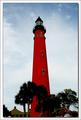
Ponce de Leon Inlet Lighthouseby GallatinComment: Nice color! I would have liked to see either more cropping at the bottom (removing the houses) or more of the base of the tower and houses. As it is now they appear floating. |
| Photographer found comment helpful. |
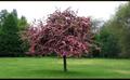
| 05/20/2004 12:28:22 PM |
Treeby redmoonComment: Not bad, but the top and bottom borders are a major distraction. |
| 05/20/2004 12:26:53 PM |
|
| Photographer found comment helpful. |
| 05/20/2004 12:25:28 PM |
Sharing Wisdomby soccerdadComment: Lighting is very nice. The two dark figures in the back are a bit distracting, my eyes keep wandering to them instead of the center figure. |
| Photographer found comment helpful. |
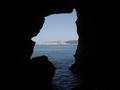
| 05/19/2004 06:17:31 PM |
Sunny Jim Caveby theSajComment: Nice view, would have liked it better with more of the dark left and right parts cropped off. |
| Photographer found comment helpful. |
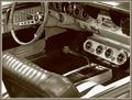
| 05/19/2004 06:08:53 PM |
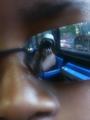
A "Shift" Back to the Pastby tfarrell23Comment: Composition is very good, and I like the 'slick' atmosphere of this image a lot! The link to the challenge seems a bit weak though, I guess the knob of the stick-shift is centered intentionally... |
| Photographer found comment helpful. |
| 05/19/2004 05:43:21 PM |
|
| Photographer found comment helpful. |
Home -
Challenges -
Community -
League -
Photos -
Cameras -
Lenses -
Learn -
Help -
Terms of Use -
Privacy -
Top ^
DPChallenge, and website content and design, Copyright © 2001-2025 Challenging Technologies, LLC.
All digital photo copyrights belong to the photographers and may not be used without permission.
Current Server Time: 07/18/2025 11:22:01 AM EDT.