| Author | Thread |
Comments Made During the Challenge  |
|
|
05/21/2004 10:28:10 PM |
|
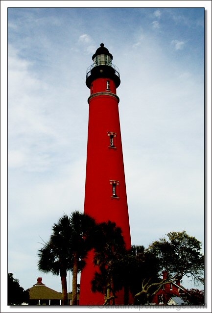
Nice, but I'd reconsider the distracting border. |
|
 Photographer found comment helpful. Photographer found comment helpful. |
|
|
05/21/2004 04:10:51 PM |
|
Nice color. Cool subject! 6 |
|
| Photographer found comment helpful. |
|
|
05/20/2004 12:39:16 PM |
|
Nice color! I would have liked to see either more cropping at the bottom (removing the houses) or more of the base of the tower and houses. As it is now they appear floating. |
|
| Photographer found comment helpful. |
|
|
05/19/2004 02:27:10 PM |
|
| Photographer found comment helpful. |
|
|
05/19/2004 10:52:36 AM |
|
This shot absolutely belongs on a postcard. Great job! |
|
| Photographer found comment helpful. |
|
|
05/19/2004 10:52:09 AM |
|
I like the red and the blue. I also like the slightly blurred trees. I'm trying not to be a stickler about the guidelines of the challenge but they did say specifically, 'dead center' and this isn't. It is only horizontally centered. I gave it a five because of that. Otherwise I would give it a 6. |
|
| Photographer found comment helpful. |
|
|
05/19/2004 01:00:40 AM |
|
Very striking building especially in that shade of red. Awesome details of the clouds as I can see every wisp. The lighthouse and the trees in the foreground are a different story as the lighthouse shows some compression artifacts (near the second window) and the middle tree's leaves are a blur. |
|
| Photographer found comment helpful. |
|
|
05/18/2004 03:19:18 PM |
|
Great colors! Would make a very nice postcard. :-) |
|
| Photographer found comment helpful. |
|
|
05/17/2004 06:19:36 PM |
|
Lovely, vivid colouring on this. The angle and composition really emphasize the size of the lighthouse. The only thing I don't care much for is the border (the drop shadow distracts me) but I'm not taking off points for that. |
|
| Photographer found comment helpful. |
|
|
05/17/2004 04:36:45 PM |
|
whooh red! I would have liked the sky to be a bit more blue to give more 'life' to the red and two more 'but's: it seems like the lighthouse is a bit out of balance and the border...it's personal, I know, but I find it an offence to your own creativity to let photoshop create this cliche border around your photo.. There are a lot more aspects in your picture that I do like, I give it a 7 |
|
| Photographer found comment helpful. |
|
|
05/17/2004 01:16:06 PM |
|
looks like an old fashiond postcard 8 |
|
| Photographer found comment helpful. |
Home -
Challenges -
Community -
League -
Photos -
Cameras -
Lenses -
Learn -
Help -
Terms of Use -
Privacy -
Top ^
DPChallenge, and website content and design, Copyright © 2001-2026 Challenging Technologies, LLC.
All digital photo copyrights belong to the photographers and may not be used without permission.
Current Server Time: 07/01/2026 04:34:39 PM EDT.