| Image |
Comment |
| 11/05/2004 07:15:41 AM |
The Gossipby skiefComment: this is a sweet candid-looking shot. i like the tones of the black and whites (it certainly works for a shot of this style) and the moment you've catured your subjects promotes interest. it's let down slightly by the whiting out of the background, but that aside a very likeable image. 8. |
 Photographer found comment helpful. Photographer found comment helpful. |
| 11/05/2004 06:58:56 AM |
Kind of Blueby fisheyeComment: this is good in terms of being a great idea. i'm not overly keen on the multiple light sources that gives the three silhouette aspect to the picture - i think one solitary more powerful light source would give a greater defined shadow. the shot also appears quite grainy, and a wash with noise reduction software might have given a cleaner image. 4. |
| Photographer found comment helpful. |
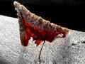
| 11/05/2004 05:07:38 AM |
Waiting for the autumn sun to warmby Bela45Comment: the details in this are beautiful. the frost and ice looks so delicately intricate. this is a truly lovely shot, though the only aspect i'm not thoroughly keen on is the area of almost black in the top right. just doesn't seem natural. there are some fantastic elements of the shot, including the lighting (with it from behind the leaf so you can see veins) and again, the fluffy ice. very nice indeed. 8. |
| Photographer found comment helpful. |
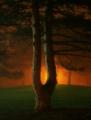
| 11/05/2004 04:53:59 AM |
The Sistersby timmiComment: should be included as an illustration in a book of fairy tales. feels very dave mckean. i like the haziness, and the light from behind really adds a unique dimension to the picture. you certainly have a good eye for this sort of stuff, so well done! 9. |
| Photographer found comment helpful. |
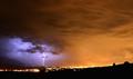
| 11/05/2004 04:48:26 AM |
Midnight Stormby sharveyComment: this is very stirring stuff. colours are very dramatic here, and visually appealling. the fact that you resisted temptation and haven't gone and focused just on the area of sky with the lightning bolt should be commended - the fact that it only occupies a small piece of sky gives some balance to the shot and a great sense of scale. it's a pity in a geographical sense that the landscape is so dull in comparison (more city or more rugged ruralness might have been better) but you've worked around that well by taking the focus into the sky. it's a masterclass in cropping and composition. definitely belongs in my little box of 10s!
P.S for some reason the sky puts me in mind of a guinness commercial. now i fancy a pint. |
| Photographer found comment helpful. |
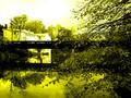
| 11/04/2004 09:49:56 AM |
Légaré Millby grandmarginalComment: beautiful. it's a strange choice of tone in terms of colour, but i think it actually works exceedingly well and should be saluted. this is also one of the few cases where the reflection filling half or more than half the frame (one of my own personal big gripes at the moment) seems appropriate. it's a very calming gorgeously serene image. and it's a 10. |
| Photographer found comment helpful. |
| 11/04/2004 09:41:10 AM |
Golfing in Paradiseby JasonComment: very pictureesque, but sadly, not being a golfer, doesn't really do anything for me. in fact, i suspect the golfing aspect detracts a little bit from the natural beauty already in the shot... 4. |
| Photographer found comment helpful. |
| 11/04/2004 09:32:49 AM |
The Dark Halfby magicshutterComment: interesting editting and graphic artwork. the fact that you didn't just do a straight line down the face makes it look more natural. the orange neck looks a little odd though. i don't know how well it'll do in terms of appreciation from the voters - i fear not too well. i like it though, finding it quite striking. stupid point, but i think it might look a little better if it were squarer - the width doesn't naturally match the height. that aside, good stuff! 7. |
| Photographer found comment helpful. |
| 11/04/2004 09:15:38 AM |
Blazing Pampasby strangeghostComment: gorgeously lovely. this is brilliantly beautiful. quite frankly, this is inspiring subject matter, expertly taken, nicely composed and is lovely to stare at. i'd be very interested in knowing what camera and lens combo you used for this. lovely and unique. 10 |
| Photographer found comment helpful. |
| 11/04/2004 09:11:44 AM |
In the Bright Lights of the Fairby alsatiaComment: the main problem is the lack of sharpness and focus. the angle also doesn't help matters - the fact that each jar is full of different colours is not that obvious, all you can see is mostly whiteness of the glass. getting further down, or indeed going a bit higher would probably help. i'd imagine the ambient lighting wasn't very useful, and as a consequence it would be very difficult without a tripod to get pin-sharp. conceptually, it's very interesting. 4. |
| Photographer found comment helpful. |
Home -
Challenges -
Community -
League -
Photos -
Cameras -
Lenses -
Learn -
Help -
Terms of Use -
Privacy -
Top ^
DPChallenge, and website content and design, Copyright © 2001-2025 Challenging Technologies, LLC.
All digital photo copyrights belong to the photographers and may not be used without permission.
Current Server Time: 08/18/2025 07:42:12 AM EDT.