| Author | Thread |
|
|
11/08/2004 07:22:49 PM |
|
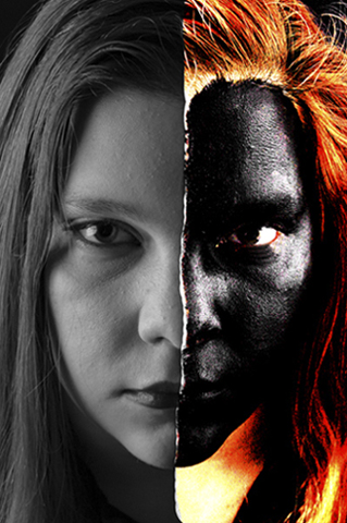
I think the left part is not sufficiently expressive here to make it appealing. Perhaps if it was made in high key and equally contrasty as the right side it would be more balanced? Not sure. |
|
 Photographer found comment helpful. Photographer found comment helpful. |
|
|
11/08/2004 02:56:35 AM |
This is a terrific image, and a very interesting technique. I didn't vote in this challenge, but if I had this would have been at the top of my list. Well done.
|
|
| Photographer found comment helpful. |
Comments Made During the Challenge  |
|
|
11/07/2004 05:37:44 PM |
|
This is quite clever, and a little unnerving. |
|
| Photographer found comment helpful. |
|
|
11/07/2004 01:35:03 PM |
|
The most interesting execution in the challenge. I can't wait to see how this effect was achieved. |
|
| Photographer found comment helpful. |
|
|
11/07/2004 06:42:17 AM |
|
|
|
11/07/2004 05:35:11 AM |
|
I can see that there is technique here - but unfortunately the photo does not appeal to me. |
|
| Photographer found comment helpful. |
|
|
11/05/2004 05:23:40 PM |
|
I've probably spent more time looking at this photo than any other so far. It is an interesting image, a bit disconcerting. I can imagine a number of magazines that would publish it for a variety of purposes. In the DPC forum, it is a bit risky and I would be surprised if it scores well. But I like the fhat you're willing to take risks. Good job. |
|
| Photographer found comment helpful. |
|
|
11/05/2004 01:45:29 PM |
|
Very nice portrait, but I believe that the post-processing will bring your score down. It appears to be more digital art than photography in my opinion. The original portrait is terrific, and might be pushed a little more with contrast and levels. |
|
| Photographer found comment helpful. |
|
|
11/04/2004 10:03:09 PM |
Returning for comments.
Great artistic study. I would have added the missing bit of chin. outside of this minor item you have my total praise for this effort. Bumping up. |
|
| Photographer found comment helpful. |
|
|
11/04/2004 09:32:49 AM |
|
interesting editting and graphic artwork. the fact that you didn't just do a straight line down the face makes it look more natural. the orange neck looks a little odd though. i don't know how well it'll do in terms of appreciation from the voters - i fear not too well. i like it though, finding it quite striking. stupid point, but i think it might look a little better if it were squarer - the width doesn't naturally match the height. that aside, good stuff! 7. |
|
| Photographer found comment helpful. |
|
|
11/04/2004 04:41:58 AM |
|
Awesome, but is it real? How did you do it? Giving you 7 |
|
| Photographer found comment helpful. |
|
|
11/04/2004 02:07:44 AM |
you've been playing with blending modes, and i thought they were not useful!!. 7
|
|
| Photographer found comment helpful. |
|
|
11/03/2004 11:25:46 PM |
|
I like the contrasts, but the chin didn't line up well and detracted a lot from the tearing effect. |
|
| Photographer found comment helpful. |
|
|
11/03/2004 09:28:57 PM |
|
Yikes. You'll get the desired effect with this one. |
|
| Photographer found comment helpful. |
|
|
11/02/2004 11:14:54 PM |
|
Ohhh I want to try this. Very creative. |
|
| Photographer found comment helpful. |
|
|
11/02/2004 11:09:56 PM |
|
| Photographer found comment helpful. |
|
|
11/02/2004 02:52:19 PM |
|
Scary.. how did you manage to do that? |
|
| Photographer found comment helpful. |
|
|
11/01/2004 12:05:36 PM |
|
I know a lot of work went into this shot...but I'm not sure that the lighting was apropriate. |
|
| Photographer found comment helpful. |
|
|
11/01/2004 03:21:20 AM |
|
Nicely done. Is that just a photo you found on the right, or actually another photo of this model? It does look like her, so a great match if not. |
|
| Photographer found comment helpful. |
Theme:
Classic /
System /
Light /
Dark
Home -
Challenges -
Community -
League -
Photos -
Cameras -
Lenses -
Learn -
Help -
Terms of Use -
Privacy -
Top ^
DPChallenge, and website content and design, Copyright © 2001-2026 Challenging Technologies, LLC.
All digital photo copyrights belong to the photographers and may not be used without permission.
Current Server Time: 10/03/2026 03:07:21 AM EDT.






 Add photograph to your favorites
 Add photographer to your favorites


