| Author | Thread |
Comments Made During the Challenge  |
|
|
11/07/2004 07:51:12 PM |
returning for comments.
A poster like effect with that semi abstract feel. Good entry. Bumping up. |
|
 Photographer found comment helpful. Photographer found comment helpful. |
|
|
11/07/2004 03:39:31 PM |
|
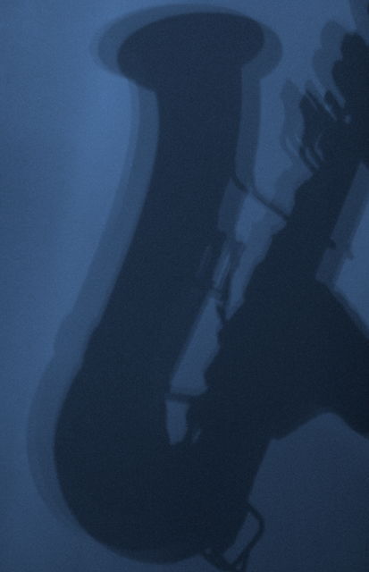
This is such a cool idea, the blue tones work really well. I would've liked to see it a little cleaner. |
|
| Photographer found comment helpful. |
|
|
11/05/2004 06:58:56 AM |
|
this is good in terms of being a great idea. i'm not overly keen on the multiple light sources that gives the three silhouette aspect to the picture - i think one solitary more powerful light source would give a greater defined shadow. the shot also appears quite grainy, and a wash with noise reduction software might have given a cleaner image. 4. |
|
| Photographer found comment helpful. |
|
|
11/03/2004 03:34:21 PM |
|
good idea, but not enough constrast and way too much noise don't add to the shot. |
|
| Photographer found comment helpful. |
|
|
11/01/2004 02:54:29 PM |
|
Interesting shot. Like the blue gradients. Well balance shadow effect from the exposure. |
|
| Photographer found comment helpful. |
|
|
11/01/2004 12:10:07 PM |
i like this.. needs a touch more brightness or contrast i think.
|
|
| Photographer found comment helpful. |
|
|
11/01/2004 02:44:09 AM |
|
It's a lovely picture. The only comment I have is you could use some noise-remover. Making this pic smooth would make it even better. After all this is a members challenge. Still I like it a lot |
|
| Photographer found comment helpful. |
Home -
Challenges -
Community -
League -
Photos -
Cameras -
Lenses -
Learn -
Help -
Terms of Use -
Privacy -
Top ^
DPChallenge, and website content and design, Copyright © 2001-2026 Challenging Technologies, LLC.
All digital photo copyrights belong to the photographers and may not be used without permission.
Current Server Time: 07/01/2026 07:54:23 PM EDT.