| Author | Thread |
Comments Made During the Challenge  |
|
|
11/06/2004 08:27:06 AM |
|
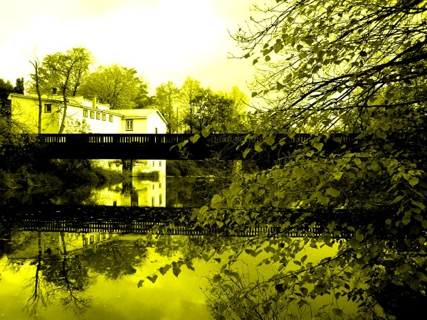
Parts of the house and the sky are blown out. The duotone conversion is not apealing to me. |
|
 Photographer found comment helpful. Photographer found comment helpful. |
|
|
11/06/2004 07:09:23 AM |
I've been playing around with duotone images myself, (I assume this is a duotone?). Quite a pleasing composition, nice reflections. The highlighs are a little harsh I think.
I'm not sure that the yellow is the right tone for my taste but hey if it works for you that's what counts the most. Nice shot, well done. |
|
| Photographer found comment helpful. |
|
|
11/05/2004 02:20:57 PM |
|
Nice scene, but I hate the colors. |
|
| Photographer found comment helpful. |
|
|
11/05/2004 02:03:32 PM |
|
Beautiful setting. My only two complaints are the yellow-green cast and too much of the bush/tree on the right taking up the frame. |
|
| Photographer found comment helpful. |
|
|
11/04/2004 10:09:22 PM |
|
beautiful shot, too bad the exposure is uneven, bad color adjustment |
|
| Photographer found comment helpful. |
|
|
11/04/2004 10:57:10 AM |
|
Not sure I'm fond of the toning here... it leaves me with the impression that this area is a little too close to a nuclear reactor, in all honesty... :/ |
|
|
|
11/04/2004 09:49:56 AM |
|
beautiful. it's a strange choice of tone in terms of colour, but i think it actually works exceedingly well and should be saluted. this is also one of the few cases where the reflection filling half or more than half the frame (one of my own personal big gripes at the moment) seems appropriate. it's a very calming gorgeously serene image. and it's a 10. |
|
| Photographer found comment helpful. |
|
|
11/04/2004 04:48:00 AM |
|
| Photographer found comment helpful. |
|
|
11/02/2004 11:45:53 PM |
the green doesnt work for me
|
|
|
|
11/02/2004 10:31:33 PM |
|
Color is outta wack and over exposed. Was this intentional? |
|
| Photographer found comment helpful. |
|
|
11/02/2004 09:22:00 AM |
|
I am very sorry but the green/yellow tone isn´t very appealing to me so I didn´t rate it very high but if you like it, that´s all that matters right? |
|
|
|
11/02/2004 04:33:41 AM |
|
too much of something here, contrast saturation? i dont know but the image is wonderfull just the post processing |
|
| Photographer found comment helpful. |
|
|
11/01/2004 07:24:23 PM |
|
Interesting choice of color. It seems to be a calm, serine scene but your color removed the serenity and aded chaos. The building is over exposed as well. This might have been good in sepia, I don't know. Good effort though. |
|
| Photographer found comment helpful. |
Home -
Challenges -
Community -
League -
Photos -
Cameras -
Lenses -
Learn -
Help -
Terms of Use -
Privacy -
Top ^
DPChallenge, and website content and design, Copyright © 2001-2026 Challenging Technologies, LLC.
All digital photo copyrights belong to the photographers and may not be used without permission.
Current Server Time: 07/01/2026 06:33:15 AM EDT.