| Image |
Comment |
| 06/26/2006 08:25:24 AM |
His Final Fareby muur88Comment: the colours, textures, feel, composition are all top notch here. i'm pleased you made the sensible choice to have the cab moving in lieu of panning with it, those walls are brilliant. i also like very much how the yellow lines are so bright and bold. great choice of subject matter as well, genius in fact! 9. |
 Photographer found comment helpful. Photographer found comment helpful. |
| 06/26/2006 08:19:32 AM |
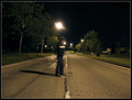
Alone In The Streetby LERtasticComment: i ike the slightly surrealness of this picture; puts me in mind of "fight club" for some reason... i like that the subject is the blur, rather than the background, which i think is a creative take on the challenge. it feels wonky though, even though the horizon does look horizontal - i'm not sure what it is (camber in the road surface, illusion of the taller trees on the left?) but it is a distraction. as is the big street light right above your subject; i think you could have got round this by doing a more wide-screen type crop, like 10mm above and below your subject; not sure this would be 160px though... like it overall though, both conceptually and in execution. 7. |
| Photographer found comment helpful. |
| 06/26/2006 08:12:40 AM |
Time for Sparklersby philupComment: apart from the unfotunate result that it looks like he has no arms, this is a good picture and take on the challenge. best bit is the unconventional viewpoint, as it does stir interest. the colours could do with a bit of lifting in some way; his face appears a bit blue, and the greens a tad washed out. a bit more contrast and a slight red increase might give more natural colours. nice happy feeling shot though. 6. |
| Photographer found comment helpful. |
| 06/26/2006 08:09:30 AM |
Flying the Flagby WobbleComment: hee! i would have though it would be more of a challenge to find a car without the flag in the last week or so! from the wing mirror and the door handle and similar details, you can tell this is a sharp, well timed, well captured moving image; but it feels let down by the flappiness of the flag. i think this is where the motion blur requirement of the challenge doesn't quite fit the nature of the shot. it's a pity it wasn't a flag not saying england - i think the lack of text would make it appear less apparently flappy.
it's also let down a bit by the agressive crop of the cars nose and the tightness towards the rear. the only way round this would be to crop much closer to the flag. still, merit should be given in that it is a welcome non-conformist shot from the typical car panning picture, and the motion blur is caught in such a way that it gives a great impression of speed. 6. |
| Photographer found comment helpful. |
| 06/26/2006 06:01:32 AM |
Cruisingby LalliSigComment: very professional looking shot, very much like it's straight out of the brochure. it having the model number on the number plate just adds to the overall polished impression (got a mate who works for volvo?) the composition is good in that it gives equal billing to the car and the landscape, though one gets the sneaking suspicion i would like to have the car at a more 3/4 view. and like any good volvo, it's good to see that it has its headlights on, even in broad daylight. a good take on a familiar kind of promotional car shot - 8. |
| Photographer found comment helpful. |
| 06/26/2006 03:26:03 AM |
Greyledge Fallsby SJCarterComment: this is cetainly picturesque and serene. the lighting and colours are what make this exceedingly plasing, and the neat, sensible composition helps too. i love the greens in this picture - so bold and bright! only minor criticism is that i think the frame is a bit too swanky for its own good, but that aside, this is a great take on the challenge, and would fit in any stock library. 8. |
| Photographer found comment helpful. |
| 06/26/2006 03:23:11 AM |
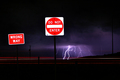
Danger Zoneby M.O.C.Comment: this is a slightly unusual composite of subjects, and i think it's slightly bursting with too many good ideas... the capture of the lightning storn is very successful and dramatic, but the impact is lessened due to the signs which admittedly serve a purpose in context, but not to the benefit of the shot. also the motion blur is incidental, rather than integral to the picture. i think voters, myself included, generally likes a bit more emphasis and obviousness with regards to that sort of thing. 6. |
| Photographer found comment helpful. |
| 06/23/2006 10:41:35 AM |
Dialby moonaustComment: this is an odd choice of subject matter for a challenge such as this; can't really see any reason for the 30 second exposure here. voters like a bit of obviousness when it comes to complying with the challenge. it's a reasonable macro, though. 4. |
| 06/23/2006 10:38:00 AM |
through the nightby gocComment: there really appears to be too much darkness and black to make this landscape fully engrossing and captivating. i think basically you're just too far away. 5. |
| Photographer found comment helpful. |
| 06/23/2006 10:30:13 AM |
City Glowby mhpnzComment: this is rather stunning. it's let down a bit by the harsh banding eveident in the difference between the yellows, oranges and reds, but that aside it has very many strong points. the soft glow eminating from the water is gorgeous, as are the streaks of light in the sky. it's a pity spot editing isn't allowed as you could 1) make the land in the background a bit darker (it looks a tad washed out / orange to me) and 2) get rid of that little red dot in the foreground. these are minor complaints though - overall this is a stirring and dramatic landscape. 9. |
Home -
Challenges -
Community -
League -
Photos -
Cameras -
Lenses -
Learn -
Help -
Terms of Use -
Privacy -
Top ^
DPChallenge, and website content and design, Copyright © 2001-2025 Challenging Technologies, LLC.
All digital photo copyrights belong to the photographers and may not be used without permission.
Current Server Time: 08/16/2025 07:07:15 PM EDT.