| Image |
Comment |
| 02/22/2004 10:55:08 PM |
|
 Photographer found comment helpful. Photographer found comment helpful. |
| 02/22/2004 09:44:42 PM |
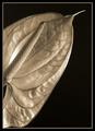
Anthuriumby admart01Comment: The tones you used are great, makes the photo stand out. |
| Photographer found comment helpful. |
| 02/22/2004 09:42:38 PM |
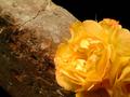
The Golden Wallby tyt2000Comment: The lighting is what makes this photo great. The only thing I don't like are the few blown out spots in the bottom right corner |
| Photographer found comment helpful. |
| 02/22/2004 09:41:33 PM |
Cone and Shadowby FSCNitroComment: I like the lighting you used, but I think it would have been better if the transition from light to dark was smoother. |
| Photographer found comment helpful. |
| 02/22/2004 09:40:47 PM |
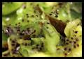
Kiwifruitby AnjellaComment: Too much of this is out of focus. You probobly couldn't help it with a macro like this, but having more in focus, and one psrticular subject that stands out would help. |
| Photographer found comment helpful. |
| 02/22/2004 05:12:53 PM |
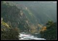
Painted landscapeby DBoyComment: Great landscape, its a shame there is mist, or fog in the scene. The lighting could also be better. |
| Photographer found comment helpful. |
| 02/22/2004 05:11:18 PM |
fluffyby Rando D300Comment: The bcakground is too busy, there are lots of things that are distracting me from the bird |
| 02/22/2004 05:09:50 PM |
Pocket changeby dtouch1Comment: Too random, I think you could use one subject, one coin thats bigger than the rest maybe so that you have a particular subject that stands from the rest, |
| Photographer found comment helpful. |
| 02/22/2004 05:07:34 PM |
Concreteby weavercComment: The sunllgiht is too bright, there are places that are too bright, and places that are in deep shadow. You should also position the subject so its not directly in the middle, should help with composition. |
| 02/22/2004 05:05:09 PM |
Orangebladeby ChezComment: This would have been a lot better if the orange was farther over to the left, an we could see more of the knife. There is also a lot of detail that I don't see on the orange, its probobly hard to get the lighting right to get that texture to stand out. |
| Photographer found comment helpful. |
Home -
Challenges -
Community -
League -
Photos -
Cameras -
Lenses -
Learn -
Help -
Terms of Use -
Privacy -
Top ^
DPChallenge, and website content and design, Copyright © 2001-2025 Challenging Technologies, LLC.
All digital photo copyrights belong to the photographers and may not be used without permission.
Current Server Time: 08/04/2025 02:06:25 PM EDT.