| Image |
Comment |
| 02/20/2004 07:26:16 AM |
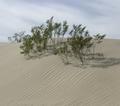
Dry Heatby beekperComment: Really like your sand stripes and the overall composition. The natural lighting didn't cooperate with you on this day as it's flat. An angled light would have given the strips more punch and accented the trees (a nice compositional element as is the sky) |
 Photographer found comment helpful. Photographer found comment helpful. |
| 02/20/2004 07:24:38 AM |
|
| Photographer found comment helpful. |
| 02/20/2004 07:24:06 AM |
MOMENTby SIDUS1Comment: Good use of dof in this case. I'm not sure what the original color was but I think I'd like to see some (desaturated perhaps) to give this some life. |
| 02/20/2004 07:22:47 AM |
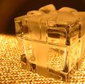
Package of Lightby lear202btComment: Ah the Tiffany crystal box! Interesting lighting effect. I'd like to be closer to sense the texture I know is within the frosted/clear glass. |
| Photographer found comment helpful. |
| 02/20/2004 07:21:40 AM |
|
| 02/20/2004 07:21:05 AM |
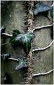
Ivy Leagueby MikeOComment: clever title, interestin composition (circular vines and strong center line add visiual interest as well as texture) I usually like monochromatic treatments but I think in this case I'd like a wider color palette. Accent lighting might be all that's needed. |
| Photographer found comment helpful. |
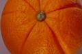
| 02/20/2004 07:19:19 AM |
Orange Orangeby 37vaComment: One of the better "orange" shots because of your different pov. Adding the stem spot adds a texture as does the wrinkles/creases. Lighting seems a bit flat. |
| Photographer found comment helpful. |
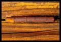
| 02/20/2004 07:18:00 AM |
Textureby TiberiusComment: Nice composition (border adds a pleasing boundary) and the center placement of the hinge works. To make this solid shot work better for me, I'l like a bit more lighting and a closer look at both the rust and the wood. |
| Photographer found comment helpful. |
| 02/20/2004 07:15:58 AM |
Wooden Ladyby oksamitComment: Unique idea here - bit of glare but it's not directly on your subject. The blue tints everything and the wonderful wood/brown colors are muddy because of it. I don't know much about filtering that out but I'm thinking that playing around with the color adjustment could eliminate some of it. |
| Photographer found comment helpful. |
| 02/20/2004 07:14:22 AM |
Midnight Tee Timeby mudsharkComment: Fun play with the moon idea (creative) I like that only a cresent is lit but I think it would be more impactful if it was lit more. This might bring out the dimples (the obvious subject of your texture shot) |
Home -
Challenges -
Community -
League -
Photos -
Cameras -
Lenses -
Learn -
Help -
Terms of Use -
Privacy -
Top ^
DPChallenge, and website content and design, Copyright © 2001-2025 Challenging Technologies, LLC.
All digital photo copyrights belong to the photographers and may not be used without permission.
Current Server Time: 08/14/2025 03:16:26 PM EDT.