| Image |
Comment |
| 08/24/2004 11:49:09 PM |
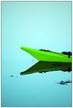
Neon boatby JohannesFrankComment: Technical 2.5/3 - nice colours and tonal range, but seems oversharpened with noticeable halos
Creative 2.5/3 - love the subject, restricted palette, and thoughtful composition; might like to see the subject a little lower in the frame
Meets competition 3/3 - after so many godforsaken bar signs, this is a breath of fresh air in more ways than one
Emotional 1/1 - I like the peaceful feeling it projects
One of my favourites of the competition 9/10 |
 Photographer found comment helpful. Photographer found comment helpful. |
| 08/24/2004 11:43:58 PM |
Separeted Worldsby MonaComment: I like the dark mood, the bold colour, the the strong simple composition. It has a couple of very bothersome clangers for me though. It is oversharpened to the degree where the resulting halos are quite distracting. Also, it drives neurotic me crazy when there are spelling mistakes in the title. Good job overall: 6. Good luck. |
| Photographer found comment helpful. |
| 08/24/2004 11:35:25 PM |
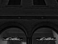
et ceteraby undieyatchComment: Honestly, if I see one more store window neon sign anytime soon I'm going to hurl ... BUT, I will make a rare exception and acknowledge that I like this shot. I buy into its 'after hours' mood. The repetition in the image (while not entirely your creation - the designer of the display should get much of the credit) is attractive. Your choce of black and white adds very effective emphasis. Good sharpness and tonal range. Meets the challenge. 7
|
| 08/24/2004 11:28:27 PM |
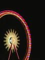
Ferris Wheelby BeeGeeComment: Technical 3/3 - very well executed, great contrast, colour, feeling of speed conveyed by the blur
Artistic 2/3 - feel like I've seen it before, but I appreciate the thoughtful composition
Meets the competition - you bet, 3/3
Emotional - 0/1 - just a personal thing, ye old fairground-at-night shot just don't turn my crank, not your fault :)
8/10 - certainly among the cream of the crop |
| Photographer found comment helpful. |
| 08/23/2004 11:54:42 PM |
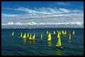
Little Sails by aznymComment: Eye catching. Nice contrast, saturation, and bold 'neon colours'. I would like it more if the horizon line weren't so centered, and if it were more tightly cropped.
Technical 2/3
Artistic 1.5/3
Thematic fit 2.5/3
Emotional Impact 0/1
6/10 |
| Photographer found comment helpful. |
| 08/23/2004 12:07:32 AM |
|
| Photographer found comment helpful. |
| 08/23/2004 12:05:39 AM |
Radiant by Mary Ann MeltonComment: Wow - a blue ribbon on your first challenge entry! DPC is a breeze, isn't it :) Congratulations. |
| Photographer found comment helpful. |
| 08/22/2004 11:56:48 PM |
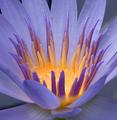
Botany: The study of plants.by aKiwiComment: Best I have seen.
Technical 3/3 (must have been tricky to light both subjects well!)
Artistic 3/3
Thematic Fit 3/3
Emotional Impact 1/1
10/10 |
| Photographer found comment helpful. |
| 08/22/2004 11:11:21 PM |
|
| Photographer found comment helpful. |
| 08/22/2004 10:54:19 PM |
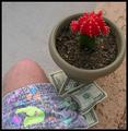
Wiltby dustin03Comment: Interesting subject and abstract composition. I like the reddish stems against the rough B&W wall. Imagine is very soft & grainy, and the black (soil?) foreground doesn't contribute so I would consider cropping. |
| Photographer found comment helpful. |
Home -
Challenges -
Community -
League -
Photos -
Cameras -
Lenses -
Learn -
Help -
Terms of Use -
Privacy -
Top ^
DPChallenge, and website content and design, Copyright © 2001-2025 Challenging Technologies, LLC.
All digital photo copyrights belong to the photographers and may not be used without permission.
Current Server Time: 08/23/2025 01:30:56 AM EDT.