| Image |
Comment |
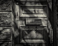
| 12/06/2012 09:35:47 AM |
Mar 11-24by bassboneComment: I would have cropped a smidge more off the top, just enough to get rid of the slight appearance of the next feature.
Otherwise I really like this photo.
edit - Sorry, I see if you do that crop, the trim on the door might be in a awkward spot. That's a tough call on that one. Message edited by author 2012-12-06 09:36:30. |
 Photographer found comment helpful. Photographer found comment helpful. |
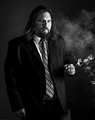
| 12/06/2012 09:05:31 AM |
Day 6by MinsoPhotoComment: This was my top vote in that challenge. It was a good image then, it still is today.
The only thing which detracts from the image is there's something hanging off your left where the blazer meets the jeans. I can't figure out what it is. |
| Photographer found comment helpful. |
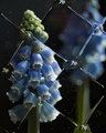
| 12/05/2012 02:12:08 PM |
05. Grape hyacinth (Mar 05)by hajekaComment: I'm thoroughly confused. Two non-food images in a row, well sort-of with this one. This is a really cool idea. Time to start making my own gelatin filters at home. |
| Photographer found comment helpful. |
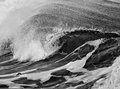
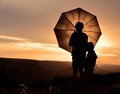
| 12/05/2012 11:20:31 AM |
Feb 25-March 10by bassboneComment: I'm having a hard time deciphering the size of the waves from this photo. It leaves me trying to figure that out. As such, I'm staring at this longer than I otherwise normally would. |
| Photographer found comment helpful. |
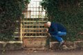
| 12/05/2012 11:18:58 AM |
Outtake: Natsumi Hayashiby mrchhasComment: In relation to the challenge outtake, I don't like it. His grip on the fence looks forced, and that's something none of hers photos ever had. They all seemed like she was supposed to be floating.
Outside of the challenge, I like the soft editing on the leaves, specifically on the left side. It really draws your eyes to the middle of the scene where the action is located. |
| Photographer found comment helpful. |
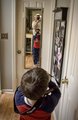
| 12/05/2012 11:16:21 AM |
#5: 3-8-2012by Art RoflmaoComment: The good ol' mirror self portrait, everyone's favorite. I guess you have to start somewhere.
Did you show him the Godzilla edit next to enhance any photo? |
| Photographer found comment helpful. |
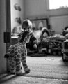
| 12/05/2012 11:14:27 AM |
Ivanhoeby GilesComment: If your son was a little more to the right or left, it would have been so much better. I think the giraffe obstructing his head almost entirely detracts a little from the image. Otherwise it's a solid image.
If you had moved just slightly to your right, then the giraffe's head, your son, and the eyes of the bed would all still be visible. Message edited by author 2012-12-05 11:15:09. |
| Photographer found comment helpful. |
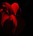
| 12/05/2012 11:11:46 AM |
02646by pixelpigComment: Looks like something that should be in a White Stripes album cover. The colors are nice and I like the triangle shadow cast from the overlapping petals. |
| Photographer found comment helpful. |
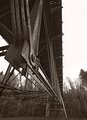
| 12/05/2012 11:10:20 AM |
5 - The Bridgeby bhugeComment: I like this style of editing for this photo. It makes it look somewhat vintage. I agree with Richard about the sky, but that's outside of your control. |
| Photographer found comment helpful. |
| 12/05/2012 09:00:34 AM |
Siblings  by AmmieComment: Originally posted by Art Roflmao:
Look at that voting graph! Nobody hated it! :) Congrats - excellent and well done! |
Not even me. Good job. |
| Photographer found comment helpful. |
Home -
Challenges -
Community -
League -
Photos -
Cameras -
Lenses -
Learn -
Help -
Terms of Use -
Privacy -
Top ^
DPChallenge, and website content and design, Copyright © 2001-2025 Challenging Technologies, LLC.
All digital photo copyrights belong to the photographers and may not be used without permission.
Current Server Time: 08/05/2025 10:50:12 PM EDT.