| Image |
Comment |
| 12/30/2004 12:11:28 AM |
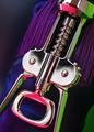
Ebenezer CorkScrooge by scalvertComment: finally, someone that used some creativity and put some thought into their entry. Surely a ribbon winner! Composed and executed very wel. 10 |
 Photographer found comment helpful. Photographer found comment helpful. |
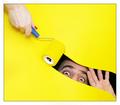
| 12/30/2004 12:07:24 AM |
Oberon's Queenby KDOComment: The bright blue border immediately takes your eye off the photo, which defeats the entire purpose of the photo. |
| Photographer found comment helpful. |
| 12/30/2004 12:02:36 AM |
Sunny Blue Eyesby spaque99Comment: Photo is tilted to the right just a tad, but it really is detracting. Other than that, it is a good photo |
| Photographer found comment helpful. |
| 12/29/2004 11:57:35 PM |
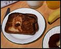
Breakfast with Homer Jby BeagleboyComment: had this been a grilled cheese sandwich with a bite taken out of it, I would give you a 15! :-) Great job. This should ribbon. 10 |
| Photographer found comment helpful. |
| 12/29/2004 11:15:51 AM |
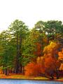
Fallingby tristaliskComment: I think this would be much better with more lake/pond and less sky. Lovely colors. |
| Photographer found comment helpful. |
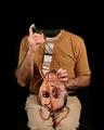
| 12/27/2004 10:34:08 AM |
Overpainting the Cask of Amontilladoby dsa157Comment: Good job Dave, I thought this was your's when I looked through the entries. The harsh lighting on Dina's hand was the first thing I noticed. Great idea for the challenge though. |
| Photographer found comment helpful. |
| 12/20/2004 08:21:03 AM |
|
| Photographer found comment helpful. |
| 12/20/2004 08:13:00 AM |
Janineby KiwiChrisComment: Overal a nice portrait, with good natural lighting. A couple nit picks, since you asked for critiques.
The highlights are just starting to blow out, especially on the neck. There are a few distracting reflections on the glasses (I've learned glasses are a pain). She is squinting a bit, particularly her left eye (our right), so you barely see the catchlight. You may have tried having her turn her head just a tad further to her left (our right), not much though.
Nice portrait though. I'm sure her parents will love it. |
| Photographer found comment helpful. |
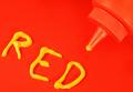
| 12/15/2004 08:31:25 AM |
The New Redby DefyTimeComment: Actually I think this is technically done well. The highlights are just a tad blown out, but just a tad. The red is fine and the contrast settings are good because you can see definition between the red background and the red bottle. I think it is a funny take on the challenge. I would have given it a 6 or 7.
A lot of the voters at DPC anymore seem to have tunnel vision when it comes to voting and have no sense of humor. Maybe if your photo would have had a yellow background, yellow bottle, with yellow letters spelling "yellow", people would have understood how it met the challenge and scored it a bit higher. Maybe... :-) Message edited by author 2004-12-15 08:31:37. |
| Photographer found comment helpful. |
| 12/13/2004 12:15:27 AM |
|
| Photographer found comment helpful. |
Home -
Challenges -
Community -
League -
Photos -
Cameras -
Lenses -
Learn -
Help -
Terms of Use -
Privacy -
Top ^
DPChallenge, and website content and design, Copyright © 2001-2025 Challenging Technologies, LLC.
All digital photo copyrights belong to the photographers and may not be used without permission.
Current Server Time: 08/26/2025 04:54:20 PM EDT.