| Image |
Comment |
| 12/11/2002 12:01:37 PM |
Birds Eye Viewby spidermanComment: Interesting image with lots of diagonals and some curves thrown in for good measure. |
| 12/11/2002 12:00:27 PM |
Leading the Choirby crabappl3Comment: Color and tonal qualities are very good. The expression is interesting. Composition and cropping good. |
 Photographer found comment helpful. Photographer found comment helpful. |
| 12/09/2002 10:17:16 PM |
Live Proudby memoComment: I love the subject. The colors are vivid and perhaps too vivid. The artsy look has an appeal but I'm not so sure it stands as straight photography. I'm not saying you should do it any differently, but for this site it's probably too artsy. The processing left marks that look like they don't belong, like on the stars.
The composition is neither divided into thirds or half. It is somewher in between and could stand to be shifted into thirds. The principle of thirds isn't right for every picture and is sometimes relied upon too heavily, and adhered to too strictly. But in my opinion, it would have worked well here. Show more of the stars on blue and a little less red and white stripes.
Great subject! |
| 12/09/2002 10:08:36 PM |
Sailboatby jcofComment: Composition here is excellent, nice a simple. Yes this is certainly art. Art isn't always understood. It would be nice to see more detail about how you did this. I think you used high contrast?
Anyway, I like it. This should be framed and sold in a nautical shop.
Tecnically I'd say this is very good work, however you processed it. The color is good too.
I like it! |
| 12/09/2002 09:59:24 PM |
Shades of blueby cathysappComment: Some of the detail seems to be lost. Perhaps a different lighting might bring out some more of it. Lightening it in a photo editing program might work too.
The composition is simple and straightforward and that is one of the fine qualities of this image. The shape stands out nicely, though a little more contrast would make it really snappier. I think the blue background is fine, but again with a little more contrast it would be sharper.
OVerall this is nice, but needs a little snap to make it more appealing. |
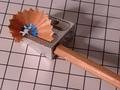
| 12/09/2002 09:47:44 PM |
Peeling Blueby paynekjComment: The background works just fine in my opinion. It supports the technical element introduced by the steel looking sharpener. I get the feeling that the pencil is being sharpened to perform and important function. No frills, just down to business.
The blue adds a touch of whimsie...a surprising bit of color. Of course the blue is essential to the challenge, but the way you incorporated it minimally works very well.
The pencil shaving is perfectly shaped. It lends a curve to the composition and is nicely placed well out of the center. The diagonal like leads right to that little bit of blue.
Two things I'd like to point out that may be improved upon. First is that I'd like to see this a little lighter. That could easily be improved in post-processing. The other thing is the couple of flecks of debris from the pencil. They are a minor distraction, but they do take away from the quality of the image.
OVerall, this is a fine picture. I love the simplicity of it and your execution is good. |
| Photographer found comment helpful. |
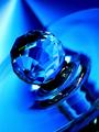
| 12/09/2002 09:25:36 PM |
Crystal Blueby LobsterClawsComment: I like this very much. The crystal is interesting to begin with and the way you used light adds even more interest.
The background works perfectly. Did you use fabric as a backdrop? What really adds intrigue is the various shapes, like the beams of varying blues radiating from near the upper left corner. My attention is drawn up to it, then it directs my eyes back to the subject.
The circular curves also guide my eyes around the image. All the subtle shapes make up a great composition.
The base of the crystal has a liquid appearance that is pleasing, and suggests motion, adding to the appeal.
Technically everything seems to be in order...focus is good, exposure is very fine with good detail where needed.
Overall you have combined good technique, interesting subject, fascinating lighting, and wonderful diagonals and curves. Ya did real good! :-)
|
| 12/09/2002 07:56:00 PM |
|
| 12/09/2002 11:31:15 AM |
|
| 12/09/2002 11:27:07 AM |
|
| Photographer found comment helpful. |
Home -
Challenges -
Community -
League -
Photos -
Cameras -
Lenses -
Learn -
Help -
Terms of Use -
Privacy -
Top ^
DPChallenge, and website content and design, Copyright © 2001-2025 Challenging Technologies, LLC.
All digital photo copyrights belong to the photographers and may not be used without permission.
Current Server Time: 08/18/2025 01:44:48 PM EDT.