| Image |
Comment |
| 06/24/2004 02:32:00 PM |
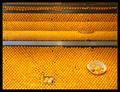
Dreams vs. Career by aaronb532Comment: Everyone is so kind. It's a good thing. But sometimes it's good to be honest. Compare first palce to second place. It just doesn't make much sense. Not attacking the blue ribbon winner. so hopefully I don't get the usual dribbling flames. Just take a good look. Not sure what to make of the winning shot. It's a good idea, and it fits the challenge perfectly. But is it a good photograph? What do people base ratings on? The degree to which the photo meets the challenge? Technical details? Aesthetics? all-of-the-above? I hate to post this here, b/c you won fair and square. I congratulate you on the ribbon, you should be proud. But people on this forum are almost disgustingly "sweet". Stop with the sycophantic panting and consider what is being said. To say this shot is great or awsome is, well. . . Congrats on the ribbon, really. Sorry to post this during your parade. Message edited by author 2004-06-24 14:36:34. |
| 06/23/2004 04:53:01 PM |
|
 Photographer found comment helpful. Photographer found comment helpful. |
| 06/23/2004 04:51:08 PM |
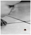
Alone by bongoComment: had the exposure been better this would have been a much more powerfull image. As it is, it's muddy and lacks any punch. I do like the idea. the cropping could have been a little tighter, but this is a subjective matter. Nice idea. |
| Photographer found comment helpful. |
| 06/23/2004 04:49:14 PM |
Dreams vs. Careerby aaronb532Comment: I have to agree. I can't see how this photo could have won a ribbon. It's just. . . well . . .it's just not good. sorry. All the faults have already been listed. |
| 06/21/2004 12:42:33 PM |
The Color of Summerby nbortonComment: nice job. i like it, it works perfectly. If his face was just a little more visible you would have gotten my first 10. So nice will have to do. I love the rope. |
| Photographer found comment helpful. |
| 06/21/2004 12:41:19 PM |
|
| Photographer found comment helpful. |
| 06/21/2004 12:40:38 PM |
|
| Photographer found comment helpful. |
| 06/21/2004 12:38:29 PM |
Beachby GolferDDSComment: nice idea, but that is horrid coloring. sorry. |
| Photographer found comment helpful. |
| 06/21/2004 12:37:54 PM |
Red Golden Deliciousby ChiquiComment: shadow should have been left dark. this hue/saturation right? apple just doesn't look natural. |
| Photographer found comment helpful. |
| 06/21/2004 12:37:17 PM |
|
| Photographer found comment helpful. |
Home -
Challenges -
Community -
League -
Photos -
Cameras -
Lenses -
Learn -
Help -
Terms of Use -
Privacy -
Top ^
DPChallenge, and website content and design, Copyright © 2001-2025 Challenging Technologies, LLC.
All digital photo copyrights belong to the photographers and may not be used without permission.
Current Server Time: 08/02/2025 08:46:30 PM EDT.