| Image |
Comment |
| 11/23/2004 09:47:57 PM |
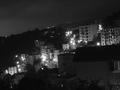
The night of the periphery of Genoaby br1mcComment: During the first pass I didn't like this. Now that I got a second look, I think I'll bump it up. It looks smoggy. I think what I didn't like at first is the tilt. |
| 11/23/2004 09:45:04 PM |
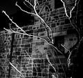
Creepyby kevrobertsonComment: This does have an erie feel to it. Looks like something left empty. The reasons I didn't give this a high score are the blown out branches and the contrast. Maybe go back just at sunset and try to get more even lighting. That should help with both the contrast and the problem with the branches. |
 Photographer found comment helpful. Photographer found comment helpful. |
| 11/23/2004 09:39:10 PM |
Seasons of Changeby MomofjoyComment: I'm sorry. There isn't anything I can say about this that is good. I can suggest that you start working on your focus. |
| 11/23/2004 09:36:48 PM |
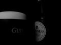
Estographyby ArnarpComment: What I've noticed is that the photograper can improve on a trite idea, the picture will get low marks. I like the profile reflection in the top of the glass. That is new! What lets the picture down is the dingy white and not so sharp focus. I think both of these could have been corrected using the basic editing rules. |
| 11/23/2004 09:29:22 PM |
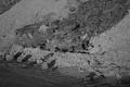
in a heap....by klazymamaComment: The shadows on the lower rocks are interesting. I noticed there are no whites in this picture. Makes it seem a bit dull. |
| 11/23/2004 09:26:50 PM |
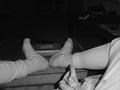
Helping Handsby frankiecool04Comment: It's out of focus, and not very pleasing to look at. I would say something nice if I could find something nice to comment on. |
| 11/23/2004 09:18:24 PM |
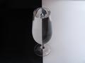
Beer dressed in black and whiteby PascalComment: It is most likely my monitor but this seems extremly dark. I do try to make sure all the bars are showing at the bottom of the page. They are showing right now but all I can see is half of the bottle label, the foam, and gui on the mug. Sorry. This would have been a wonderful picture. |
| Photographer found comment helpful. |
| 11/23/2004 09:14:17 PM |
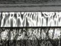
Surfacingby dncelvrComment: I wanted to like this one but there isn't enough information to decide what it is. Probably some type of macro. A good attempt, but perhaps not suited for b/w. |
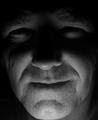
| 11/23/2004 08:50:08 PM |
Dark Portraitby ColeyComment: Good idea. Well exposed. I would have liked to see just a glimer/sparkle in the subjects eyes. The photographer could have used a mirror to reflect the light to the eyes without distrubing the low light effect. |
| Photographer found comment helpful. |
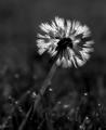
| 11/23/2004 08:22:29 PM |
Lonelinessby BradComment: I can see that the softness is from a filter effect. Imo, it doesn't add to the picture. Usually with something this delicate, I like to see all the details. Only my personal opinion. |
| Photographer found comment helpful. |
Home -
Challenges -
Community -
League -
Photos -
Cameras -
Lenses -
Learn -
Help -
Terms of Use -
Privacy -
Top ^
DPChallenge, and website content and design, Copyright © 2001-2025 Challenging Technologies, LLC.
All digital photo copyrights belong to the photographers and may not be used without permission.
Current Server Time: 08/31/2025 07:55:14 PM EDT.