| Image |
Comment |
| 10/30/2003 10:55:12 PM |
My favorite cat "Skandall"by hilmarsigComment: My, he looks like he is having a good time. I can almost hear him purring. I like how you got down to the cat's level. Good timing. If you don't mind my saying so, I think it could have been focused just a little bit better. |
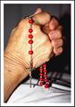
| 10/30/2003 10:38:34 PM |
A grandmother's hands in prayer.by HRoxasComment: When the challenge is over, this would look nice as a desaturated image. Good framing and placement of all the pieces. Nitpick, if you don't mind, would be the shadows. I would like to see them softer. Just a suggestion, try a black piece of cloth behind and under her hands next time. Those red beads should really pop then! |
 Photographer found comment helpful. Photographer found comment helpful. |
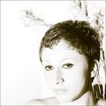
| 10/30/2003 10:30:05 PM |
Fragile ...by dimitriiComment: I'm attracted to this photo. The contrast between the model and the flowers makes the photo dynamic. The title doesn't seem to fit because the lighting is somewhat harsh and the makeup on the model's eyes make them look hard. This is just my opinion, I apologize if this offends you. |
| Photographer found comment helpful. |
| 10/30/2003 08:44:36 PM |
a cone exposed in a single shotby ursulaComment: I don't know how I missed commenting on this one. I gave you a 10 because I really liked the clarity of the top, cone and base. It did take a moment to understand, but when I did, I felt that you had done a remarkable job presenting a complex idea. Now that I refound this, I thought I would leave a note. Good job. |
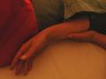
| 10/30/2003 08:15:15 PM |
when she sleepsby sergutComment: Arms and hands are very graceful. These have a lovely bend, creating a semicircle. So you did hit the challenge right on. If I could offer some suggestions as to how to improve this image. The first thing is to get rid of the distracting blocks of darkness at the top. When you have a lovely subject, sometimes less is more. If you used digital zoom, don't. It introduces too much noise and that makes the image look soft. See all those squigly patterns? It's your camera trying to create details it can't actually see.
I hope I didn't offend you. Your eye is good, just need a little more experience. |
| Photographer found comment helpful. |
| 10/30/2003 07:47:24 PM |
|
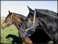
| 10/30/2003 07:31:25 PM |
A Horse Of Courseby aKiwiComment: The repetition works to add more grace to the picture. The difference in the color of the horses and halters also adds interest. There are a couple of things that you might consider improving. The nose of the horse futherest away is a little close to the outside border and the shadows are a bit distracting and they lead the eyes up to the umm.. brown patch, in the grass. |
| Photographer found comment helpful. |
| 10/30/2003 07:18:55 PM |
Green Grass Graceby GordonComment: The color is pleasing as is the composition. It might have been better to have the focus on the top drops, or at least, that's my opinion. |
| Photographer found comment helpful. |
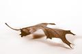
| 10/30/2003 07:15:32 PM |
remnantby mcmurmaComment: It does have graceful lines. The way that the leading point touches the surface and the other touch points are less obvious gives this a good floating feeling. |
| Photographer found comment helpful. |
| 10/30/2003 07:10:46 PM |
Mother and Sonby inspzilComment: The idea of a light on him is an excellent idea as is the darkness all around. Really focuses on the important part of the statue. Did you try placing a light behind his head. I think you might be able to get a halo effect that way. I'm sorry, but there is something on Mary's face and it makes it look like she has a mustache. |
| Photographer found comment helpful. |
Home -
Challenges -
Community -
League -
Photos -
Cameras -
Lenses -
Learn -
Help -
Terms of Use -
Privacy -
Top ^
DPChallenge, and website content and design, Copyright © 2001-2025 Challenging Technologies, LLC.
All digital photo copyrights belong to the photographers and may not be used without permission.
Current Server Time: 08/27/2025 06:43:47 AM EDT.