| Image |
Comment |
| 09/07/2003 02:51:25 PM |
A Maize of Cornby dsidwellComment: Wondering how many people commented aMAIZEing by now. Well, add me to the list. Nice shot. |
 Photographer found comment helpful. Photographer found comment helpful. |
| 09/07/2003 02:49:14 PM |
My Wedding Bear Favorsby chunsumComment: Love it! Great shot! Looks like it could go on for miles the way you shot it. Thats a lotta bears! And they all somehow look unique if you looks at them. My favorite part of the shot is the way the bear just to the right of dead center is peeking over and looking straight at me with a smile. Perfect! |
| Photographer found comment helpful. |
| 08/27/2003 10:15:52 AM |
|
| Photographer found comment helpful. |
| 08/23/2003 04:21:17 PM |
Basking in the morning sunby BlurryComment: Such a wonderfully tranquil and serene shot. Ahhh. Only if I really study what you are wearing, hey ya caught me, does my brain start to convince me that it might seem a bit strange with those darker undergarments showing. But hey, you pull it off...anyone else would have made it look completely less natural and more like a gimmick. Seems like its hard to go wrong with your look! Really love the colors too. Ahhh. I need to start eating more healthy. |
| 08/22/2003 10:13:01 PM |
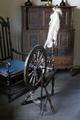
Spinning Wheelby EddyGComment: Beautiful. And shot to capture its warm and wonderful antiquity. Some might complain about the lighting from the upper right and the shadows in the lower corners, but still a great shot and works fine. |
| Photographer found comment helpful. |
| 08/22/2003 09:31:43 PM |
1931by blemtComment: Its too bad for those dang railroad lights. Well since ya can't take those things down to easily maybe just try moving a litttle bit over to get that "Harper's Ferry" a bit more centered between the posts and not crowded off as much at the left end, IF possible.. |
| Photographer found comment helpful. |
| 08/22/2003 09:26:28 PM |
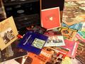
LP Hi Fi Stereoby drydocComment: Some great vinyl. Might work better with the cabinet left of the Hi-Fi cropped off...and above the back of the playing record...hate to lose too much of the Denver, but the reflection off that glass and the glimpse of the CD player kinda takes away from it a bit. |
| Photographer found comment helpful. |
| 08/22/2003 09:17:39 PM |
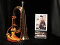
Lost Past - Last Postby hughletherenComment: This might have been better arranged a little more naturally. It is staged so neat and so linear. Kinda boxy and too much just like reading a list like this, which detracts from the nice warm feel from the bugle and photo. The tape goes against this too...seems to not fit well with the time, the mood, or the colors. Maybe just the photo sitting diagonally with the bugle laying on its side across the top of it, like they were more naturally just set there. |
| Photographer found comment helpful. |
| 08/22/2003 08:46:35 PM |
Sign of the Timesby ImagineerComment: Ha! .A posted secret, labeled "secret" on a bold background none the less. Pssst, don't tell. If you go further I wonder if there are any "super duper" secret signs. Now that would be a cool shot...if you could live to post it.
Normally I might try to make some comment about cropping out and blocking parts of the sign....but hey, since it's a secret. |
| Photographer found comment helpful. |
| 08/22/2003 08:36:21 PM |
Evil from the shadows - Lest we forgetby JC_HomolaComment: Woah, that's provacative. Sure to stir up some controversy. Definitely sets itself apart from most of the other photos in the challenge. I like the whole "shadow" thing, but could use a little more subtley balanced shadow/lighting around the emblem. Looks almost like a dark circle towards the top left of it which takes away from it quite a bit. |
| Photographer found comment helpful. |
Home -
Challenges -
Community -
League -
Photos -
Cameras -
Lenses -
Learn -
Help -
Terms of Use -
Privacy -
Top ^
DPChallenge, and website content and design, Copyright © 2001-2025 Challenging Technologies, LLC.
All digital photo copyrights belong to the photographers and may not be used without permission.
Current Server Time: 08/20/2025 04:48:29 PM EDT.