| Image |
Comment |
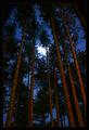
| 04/02/2004 11:36:11 PM |
Temporary Shoresby Everyday ReneeComment: The idea of this image is quite interesting, but I think that the composition is a bit problematic. The branch that intrudes into the frame from the centre bottom of the frame is very distracting, and I'm afraid that the shape of the part of the tree you've used to help frame the image on the left is a bit awkward, unfortunately. |
 Photographer found comment helpful. Photographer found comment helpful. |
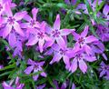
| 04/02/2004 11:32:09 PM |
Phloxby fisheyeComment: Very bright, cheerful and springlike. I like the subtle diagonal of the double line of flowers that crosses the image from the top left to near the lower right hand corner. I think that the impact of the composition would be even stronger if you were to crop up a bit from the bottom to eliminate the two isolated petals in the lower left hand corner. The image is perhaps a tad overexposed, but I don't find that bothersome. |
| Photographer found comment helpful. |
| 04/02/2004 11:27:23 PM |
tulip timeby ursulaComment: Interesting composition and very nice, rich colours. I think I would have preferred more DOF. Only the stem and lower 1/3 of the flower are really sharp. This is probably intentional, but to my taste, the image would have been more effective if more of the flower had been sharp. |
| Photographer found comment helpful. |
| 04/02/2004 01:35:52 PM |
The Treesby mariomelComment: I like the composition of this image a lot, but I find the colours perhaps a bit too saturated. The redness of the trees, given that the sky is so dark seems a bit unnatural to my eye, I'm afraid. Also, I'm not sure about the effectiveness of the very bright, white area hear the centre (the moon). |
| Photographer found comment helpful. |
| 04/02/2004 01:32:47 PM |
Churchby PoobaComment: Good, sharp detail in this image! To my eye (or perhaps it's just my monitor that's problematic), the sky seems to have a bit of a reddish or magenta cast. Perhaps it was near sunset when you took the photo, and that would explain the colour. The image needs just a little bit of rotation to the right to straighten it. |
| Photographer found comment helpful. |
| 04/02/2004 01:28:50 PM |
The Winning Messageby hughletherenComment: I like your choice of subject and background, your composition and the bright, glowing colours of the phone. I find the background just a tiny bit muddy looking. I think I'd like it to seem a bit sharper. Still, this is a very effective image in my view! |
| Photographer found comment helpful. |
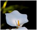
| 04/02/2004 01:26:54 PM |
The Lillyby RasaiComment: I really like the true white you've captured on the lily and the detail on the yellow stamen(?). Unfortunately, though, I think that the bright area near the top of the image on the left is quite distracting. You might think about cropping down from the top and in a compensating amount from both sides to eliminate most of the distraction. |
| Photographer found comment helpful. |
| 04/02/2004 04:22:37 AM |
|
| Photographer found comment helpful. |
| 10/01/2003 12:05:08 AM |
|
| Photographer found comment helpful. |
| 09/21/2003 03:47:26 PM |
Board Workby jxpfeerComment: Nice colours and composition, but a bit too posed to be right for the assignment, in my opinion--which is, of course, just that. |
Home -
Challenges -
Community -
League -
Photos -
Cameras -
Lenses -
Learn -
Help -
Terms of Use -
Privacy -
Top ^
DPChallenge, and website content and design, Copyright © 2001-2025 Challenging Technologies, LLC.
All digital photo copyrights belong to the photographers and may not be used without permission.
Current Server Time: 07/18/2025 05:27:22 AM EDT.