| Image |
Comment |
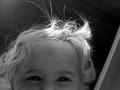
| 04/30/2002 11:51:00 AM |
looking down at daddyby jbruno1397Comment: I can't see her eyes, and while her fly-away hair is cool, her eyes are the part I really want to see. Between the dark eyes and the highlight on the hair, I keep getting pulled away from what is, to me, the most important part of a portrait. Would it have been possible to use a reflector or a piece of white card to get some light up on her face? |
| 05/01/2002 01:22:00 PM |
Light Rail Stationby marcieComment: I think this might have been a better photo as a more traditional shot (as opposed to shooting for this specific challenge) -- I like the roof as a framing element, but much of the elements at the bottom feel like they've been _just_ cropped out (whether or not they actually have) |
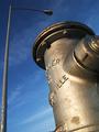
| 04/29/2002 03:02:00 PM |
A Dog's Lifeby GordonComment: nice framing and composition -- if I HAD to add a little criticism, I would have cropped it the tiniest bit tighter on the bottom to get rid of the tree tops (?) down next to the hydrant |
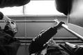
| 05/01/2002 12:36:00 PM |
The Angry Giantby chariotComment: I would have scored this one higher if you'd taken it the extra step and had the model (you?) in costume as a giant *grin* -- the main subject is under exposed, a little bit of adjustment with levels should bring that out, I think -- like the overall composition |
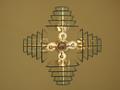
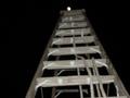
| 05/01/2002 01:53:00 PM |
Up Lightsby justineComment: I really like this. I think I would have moved it further to the right so that there is an equal margin on the top, bottom and right hand sides (and then maybe see if it looks better as a vertical with the lamp at the top or at the bottom or if it looks better horizontal). If possible (and it may not be) I'd also try to make sure that the fixtures in the middle were all squared up. |
| 04/29/2002 03:10:00 PM |
|
| 04/30/2002 11:49:00 AM |
Under Constructionby TRSchwartzComment: K, I get the challenge aspect -- considered shooting something similar -- the contrast on this seems flat though -- I also find the composition to be kind of bland -- would it have been possible to get any closer to the construction site? |
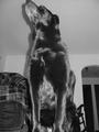
| 04/30/2002 11:35:00 AM |
Lone Doggieby ChrommonkyComment: black and white was a great choice for this one -- really shows the glossy coat -- I think it would have been better off in a less distracting space (no sofa, rocking chair, doorway, etc) and if the tip of the dog's nose hadn't been cut from the image |
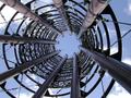
| 04/30/2002 11:41:00 AM |
spiralby tydComment: I find this one very visually interesting and am curious to find out what it is -- my own personal taste would have been to move the center of the thing further to the right (rule of thirds kind of thing) instead of so close to center |
| 04/30/2002 11:08:00 AM |
|
Home -
Challenges -
Community -
League -
Photos -
Cameras -
Lenses -
Learn -
Help -
Terms of Use -
Privacy -
Top ^
DPChallenge, and website content and design, Copyright © 2001-2025 Challenging Technologies, LLC.
All digital photo copyrights belong to the photographers and may not be used without permission.
Current Server Time: 08/17/2025 02:49:17 AM EDT.