| Image |
Comment |
| 05/12/2002 02:05:00 PM |
|
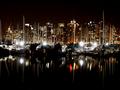
| 05/12/2002 02:18:00 PM |
Midnight Sailing In Vancouverby GtnjiggyComment: I think the picture might be a little "weak" for what you're trying to sell -- I see ships docked, none sailing. HOWEVER, the picture is very nicely done. I think maybe I would have cropped it at the 640x427 size to remove some of the extra blank sky and water -- but that's very much a personal taste |
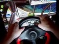
| 05/08/2002 10:54:00 AM |
geto your cavalier here!by heartsdivideComment: All the lines in the picture leade me to that house in the distance. While I like the use of curves (especially how the sidewalk kind of echoes the car) it doesn't show me much of what the car really looks like -- important to me when buying a car. While this isn't the kind of advice I like to give, I think you might be better off going with a different shot (in terms of advertising) or going for even more of an abstraction by getting even closer. |
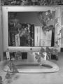
| 05/12/2002 02:15:00 PM |
Apple does Windowsby AndyLeeG4Comment: Cool Idea. The contrast seems a little flat -- perhaps that's a monitor conflict (my machine vs yours) |
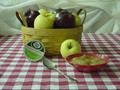
| 05/09/2002 12:03:00 AM |
Applesauceby sweetk1685Comment: Very nice. The green tint needs to be fixed -- either color balance with the camera, or some kind of levels work in your image editing software. The focus seems a tiny bit soft on the bowl and the sppon handle. My last suggestion would be a slightly tighter crop to remove some of that "extra" tablecloth space. |
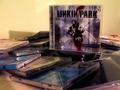
| 05/08/2002 10:47:00 AM |
Available at all leading music retailersby paully2k1Comment: Without actually knowing what any of these covers look like in real life, it still seems to me like the colors aren't right in this picture. Did you try using either your camera's color balance, or tweaking the color balance in your image editing software? |
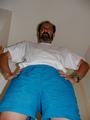
| 05/01/2002 12:28:00 PM |
Hi Dad!by lcgleahComment: the angle on this seems like it either needs to be more extreme, or non-existent (not up and down, but the side to side -- how one shoulder is closer than the other). Because of the flash, it seems like his face is a tad underexposed, and you can't see his eyes because of the flash reflection in his glasses |
| 04/30/2002 11:32:00 AM |
over exposed selfby nbortonComment: it's interesting -- and I like the way you've left the image a horizontal instead of a vert -- I think I would have tried to find somewhere where the railing in the background could have been avoided -- focus completely on you -- but that's a personal taste |
 Photographer found comment helpful. Photographer found comment helpful. |
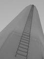
| 04/30/2002 11:19:00 AM |
Upwardby dlhComment: Composed nicely, but the contrast is flat. I also find myself wishing for one additional visual element -- since I'm not sure what this is, I don't know what element I'd suggest -- just something to contrast all the perspective lines |
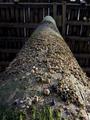
| 04/30/2002 11:39:00 AM |
Under the Pierby langdonComment: nice side lighting -- like the way the nearer barnacles sort of blend into just a texture as you get further away from the focal point -- don't now what to suggest to make it a better image -- maybe a slightly less centered composition? |
| Photographer found comment helpful. |
Home -
Challenges -
Community -
League -
Photos -
Cameras -
Lenses -
Learn -
Help -
Terms of Use -
Privacy -
Top ^
DPChallenge, and website content and design, Copyright © 2001-2025 Challenging Technologies, LLC.
All digital photo copyrights belong to the photographers and may not be used without permission.
Current Server Time: 08/17/2025 07:25:59 AM EDT.