|
|
|
Showing 291 - 300 of ~452 |
| Image |
Comment |
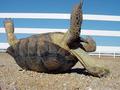
| 05/16/2002 02:45:00 PM | Help Meby mattpgaComment: I'm guessing you couldn't do anything about it, but I would REALLY love this shot if that fence wasn't in the background. I also don't know if you have a big enough image to do this with -- but I wonder how it would look if it were cropped vertically (in effect, cutting the left half of the image out of the picture). That would let you get a little bit of a closer shot on the tortoise's head. (The more I look at it that way, the more I'd personally like it -- maybe I'll talk to you baout getting a copy when the voting's over.) ;-) |
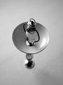
| 05/15/2002 01:03:00 PM | Shed some Lightby TRSchwartzComment: Only a couple of personal preference suggestions. It feels the tiniest bit soft, I wonder how it would look sharpened a touch. I would also have shot this so that the lamp was either closer to the top of the picture, or the bottom. (I think my preference would be the bottom.) That would give it a little more of a feel of being unbalanced. |
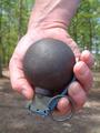
| 05/19/2002 04:26:00 PM | Kaboomby MaYzComment: Nice lighting -- really brings out the detail on the grenade. I don't think I want to know what you/your subject does for a living to have such torn up fingers. Did you decide the watch didn't work in the composition? If so, might want to try to rub out the band marks on the wrist before shooting. :-) Nice DOF and composition. |
| 05/19/2002 04:21:00 PM | Untitledby mciComment: The only reason I'm not scoring this that extra little bit higher than I already am is because of the shadow across her forehead. The one running across her arm is OK, because I can still make out the arm in the shadow, but the one across her head simply bothers me. I really like the shadow of her eyelashes and the nice composition. It's just that blasted shadow.... :-) |
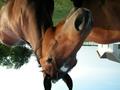
| 05/17/2002 09:37:00 AM | Twisted Twisterby tr13o10Comment: One of the more interesting, to my eye, normal subjects shot upside down pictures. In order to "critique" it, I keep finding myself wanting to turn my head over and look at it. :-) Your white levels seem just a tad high -- that wall of the building in the background is really glowing -- but maybe you needed to do that to bring out the gloss on the horse's coat. |
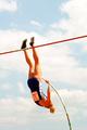
| 05/17/2002 01:48:00 PM | Up and Overby elliottwhitleyComment: Something about the colors in this make it look like an older print photograph -- like they've faded and altered with a little time -- I couldn't explain why it looks that way to me, but I like it. I can tell it's motion blur up by the feet, but other part's of the vaulter simply look out of focus -- I think going either direction with shutter speed would contribute to the picture overall. A slower one to create more blur, and a faster one to create less. |
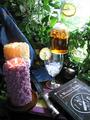
| 05/16/2002 02:58:00 PM | Tea Time at Martha Stewart'sby hokieComment: Not entirely certain I understand the title, but I like the photo. The book on witchcraft is a nice addition. I considered adding a glass of ice like this to my shot, but decided it was an unnecessary addition. Glad to see someone did it though. My only comment would be light levels. I think this is a picture that begs to be dark and moody and that overexposed upper corner kind of takes away from that. (Even if you disagree about the dark and moody, I think you would agree that it's over-exposed.) Maybe a few more plants to block off a little of that light? |
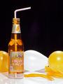
| 05/20/2002 08:36:00 AM | Weinhardt Orange Cream Soda -- When things just aren't quite right.by PatellaComment: A couple of quick comments. The light portion in the middle of the shot appears to be a lens flair of some kind. The reason it didn't get "fixed" is actually pretty simple: on my computer at home, it's not there. This is yet another of those monitor calibration problems. I believe my monitor is calibrated correctly using Adobe Gamma, but I may be wrong -- or maybe it's yours... Secondly, after having it pointed out, I tried to fix it using levels, and I don't think it's possible without radically altering the other colors. If someone would like to show me I'm wrong, I'd very much like to learn because I don't know how. A number of people mentioned using less soda. I could have, but I didn't want it to be blatantly obvious. Besides, I have the feeling that if I had used less, I would have had people telling me I should have used more. Subtlety was also a comment made by a number of people. Some thought it was too much and some thought it was great. My goal was not to make this easy to see. I hoped that knowing it was upside down, people would take an initial look, not see what was upside down, and look harder. I do that with photos when I can't see the challenge aspect -- in fact, I probably spend more time looking at photos I don't get than photos I do. I was also realistic, though, and didn't expect everybody to see it -- and I was OK with that. Finally, maybe I should have used a different kind of soda. I think some of the people who couldn't see the upside down were unable to because they thought the air bubble at the bottom of the bottle was the "cream" portion of the soda. For those of you who recognized this as an ad shot, it is. It just happens to be upside down as well. |
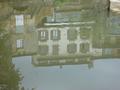
| 05/15/2002 01:07:00 PM | in the waterby wolfjackComment: Clever idea. If possible, I think I would have tried shooting this (or rotate/crop) so that the roofline was either much closer to being parallel to the image boundaries, or much further off. Even though it's a great reflection, the color of the water kind of muddies (no pun intended) the colors in the reflection. Maybe if you tried adjusting the levels a little bit to make them a little stronger? Finally, it looks like everything in the shot is reflection except that little bit up in the UR corner. I think I woud have tried to crop that out and made it completely a reflection. |
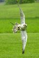
| 05/16/2002 03:05:00 PM | Natural aerobaticsby JonniboyComment: OK, I don't think there can be argument on this one. It's a great shot -- love the orientation of the bird's head in relation to the body. (Would have given some others a run for their money in the stop motion challenge.) However, I don't think you can claim it's upside down. Two comments on the photo as is: If possible, shooting from a higher position to make it all grass as a background instead of that little bit of tree, and it seems to have a bit of a green tint on the bird -- that can be a hard thing to remove easily without messing up other things -- it may also just be a kind of visual illusion. The bird might not be green but only seems that way because it's surrounded by soo much strong green. |
|
Showing 291 - 300 of ~452 |
Home -
Challenges -
Community -
League -
Photos -
Cameras -
Lenses -
Learn -
Help -
Terms of Use -
Privacy -
Top ^
DPChallenge, and website content and design, Copyright © 2001-2025 Challenging Technologies, LLC.
All digital photo copyrights belong to the photographers and may not be used without permission.
Current Server Time: 08/17/2025 09:10:14 PM EDT.
|