|
|
|
Showing 151 - 160 of ~452 |
| Image |
Comment |
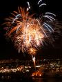
| 06/30/2002 05:04:00 PM | City Lights by brumosComment: Cool shot, but it appears to be crooked. Since I don't know the area where this was shot, perhaps it really does lie at the slight angle I see in the shot. However, without that knowledge, I'd say this needs to be rotated a few degrees clockwise. This would also make it look as if the fireworks were going straight up into the air before bursting. |
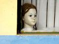
| 06/30/2002 06:59:00 PM | City Girlby JeanComment: Interesting shot. Think it could have been a little better if the head had been placed a little lower and toward the left of the frame (rule of thirds). Saying that, I don't know what's out of the frame to the right, so it might not have been possible. I just think it would have had a little more impact with a smaller margin of yellow on the left and a lsightly smaller one on the right with the rest of the background made up of the draperies/blinds. |
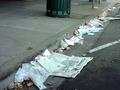
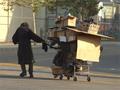
| 06/30/2002 07:05:00 PM | Home Sweet Homeby liltoolComment: OK, I know you can't actually move the trash can, but I wish it could have moved down the sidewalk about 6 feet toward you. Then you could have had this nice contrast between a trash can just sitting there and all this garbage on the street. I would suggest that you moved forward the 6 feet, but then it looks like there would be all sorts of toher stuff in the shot to serve as distractions. Anyway, nice lines -- the trash can is just a wish. :-) |
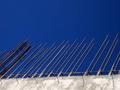
| 06/30/2002 03:35:00 PM | Inexorable Growthby superdneComment: I'm probably giving this a higher score than everybody else, but I don't care. I like the color and the abstact nature of the shot -- even though it's a very concrete (no pun intended) visual of city growth. My only concern is all the compression artifacts, particularly around the rebar. It may not be possible, but saving this as a less compressed .jpg might smooth all that out. (I notice that its file size is only about 1/3 of what it's allowed to be -- use that extra and elminate the compression.) :-) |
| 06/12/2002 12:25:00 AM | >>by mciComment: Pure fluid motion. I really wish you could have found a way to balance the dark reflection of the car with the street and buildings that are so completely blown out. (I'm guessing you had to play around a little to get the car to show up properly.) Nevertheless, I love the way this looks like liquid mercury. |
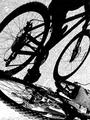
| 06/12/2002 12:00:00 AM | Shadow Riderby timj351Comment: I love the "illusion" in this that the shadow and its creator have switched places. Great call to turn it the 180. I'm having a hard time defining the element that's niggling at me. Perhaps that it's so bright? Pretty much purely black and white (I recognize that there's a lot of gray -- it's just very light). I wonder if bring up the midtones, making the ground a little darker, would help. Dunno, just my two bits. |
| 06/11/2002 11:51:00 PM | Moving, Againby GotchaComment: Very interesting capture. It looks like a little touch of sharpening might be useful, but it's a tough call because I also like it a little soft. Here's a suggestion I offer, but it's not something I'm letting influence the way I vote about this. Instead of the warm yellow tone of the picture, you might try giving it a colder blue tone in an editing program. It would help give it even more of a sense of isolation and desparation. |  Photographer found comment helpful. Photographer found comment helpful. |
| 06/10/2002 06:53:00 PM | Asphalt Mirageby hokieComment: Cheater! :-) I don't entirely get the oil paint and spatula in terms of the photo as a whole, but I like it anyway. I wish there was some way to make the change from road to print/painting/whatever a little less distinct -- kind of like you did with the rip along the top (I didn't recognize that those were real clouds and not part of the print for quite some time). But even with the obvious division between the two, I like the way this works. Well done. |
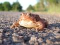
| 06/10/2002 06:45:00 PM | Toad on the Roadby connieComment: Like the way the color of the frog is echoed in the pavement. Don't know if it would be possible to get closer to the frog, but I think I would have tried. (Might not look any better than it now does, so I don't know.) The only thing I really find somewhat distracting, and it seems very small, is the pole up and to the left of the frog's right eye. It just keeps catching my attention. Like I said, though, very minor. |
| 06/10/2002 06:43:00 PM | Cotton Candy Stopby GordonComment: Beautiful colors. Two nits -- wish the edge of the sign ligned up with the edge of the frame. Also wish the red was a little more vibrant (like it seems to be where the light's reflecting on it). Well done. |
|
Showing 151 - 160 of ~452 |
Home -
Challenges -
Community -
League -
Photos -
Cameras -
Lenses -
Learn -
Help -
Terms of Use -
Privacy -
Top ^
DPChallenge, and website content and design, Copyright © 2001-2025 Challenging Technologies, LLC.
All digital photo copyrights belong to the photographers and may not be used without permission.
Current Server Time: 08/18/2025 06:17:04 AM EDT.
|