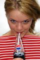
Pepsiby
arnitComment: This is a great photo. I am assuming that the red stripes in ths shirt, the incredible blue eyes on the model and the simple white background were all used to accentuate the pepsi logo.
One criticism. I hate saying this becasue the model is very attractive. Great skin, great facial features and her eyes are exceptional.
But...her lips are a major distraction. I know..I know. Jerk, numbnuts, etc, etc but I was trying to place my finger on why I was holding back on giving this photo extremely high marks.
It had all the elements. But her lips need to be absolutely perfect in color and shape because, well...you know darn well why ;-)
The lip color is more raspberry than cherry/stop sign red and her lip shape is just not appealing enough to stand out on its own. They need to be fuller and stand out more. Seeing as how she is sucking on a straw (very sexy) this leads you right up to her lips and when you do that you need perfection there or it throws your concentration off.
This is the major danger of using humans that are not professional models. They not only bring their beauty to an ad..they become the ad and very few humans are good enough for that. Thats why the super models get the big bucks. I know..your budget didn't allow for Elle this time around but I am just trying to say how powerful the human image is, even in a DP Challenge contest. I did not even use my wifes image, as pretty as she is, in my little ad because I knew exactly what I needed (in eye color/shape/drama/size, etc).
Don't mean to go on and on and bore you but I see this as one of the photos that is one of the better ones and has the potential to be the best one.
BTW, if that is your sister/neighbor/friend/wife you can still tell her she is still fine enough to stop traffic and I might buy a Pepsi or three :-)