| Image |
Comment |
| 05/07/2002 02:27:00 AM |
Snuggle Softby connieComment: This is well executed, especially the lighting. The white on the towel seems to have blown out a bit though. I don't really think it's very effective to just reproduce the imagery from the front of the product itself though... it's kinda repetitive. |
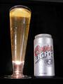
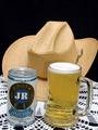
| 05/07/2002 06:12:00 AM |
Rock Onby nrouteComment: Bleh, American beer :P Nice photo, but the lighting needs more control for this kind of thing, considering there are bright highlights on the front of the glass and the can. Advertising shots avoid that kind of distraction. The camera angle also makes the composition a little bit awkward, because the perspective makes the verticle lines slant a bit. |
| 05/07/2002 02:03:00 AM |
Titleist: The #1 Ball in Golf by mattpgaComment: Hmm... the composition of this photo is not very interesting. It would only catch my eye in a magazine or something because of the stark colours. I think having the light from the sun come in from the side, creating that shadow, makes it flatter and less interesting somehow, because the shading on the ball cuts it in some fairly straight lines. Having the light more from the front would give it nicer contours. |
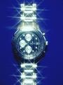
| 05/07/2002 03:16:00 AM |
Piere Cardinby doogbullComment: It's too sparkly... kinda like an early 80s advertisement. I don't think the blue background sets off the watch very well, it makes the silver seem harder and cold. |
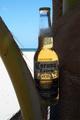
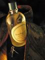
| 05/07/2002 04:10:00 AM |
La Cerveza Mas Finaby elliottwhitleyComment: I like the light coming through from behind the bottle, but unfortunately there isn't enough light from in front of the bottle to read the label clearly. |
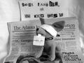
| 05/07/2002 04:01:00 AM |
Hostage Situation!by albapeteComment: Hehe, very funny and cute, and also a great use of black and white that parodies newspaper photos of real hostages. I love it :) |
| 05/07/2002 07:12:00 AM |
An Eye For Detailby hokieComment: I actually respond well to advertising photos like this one that tell a little story, even though I generally tune out ads. His tie, her earings.... well, maybe they're not naked but they're getting comfy on the couch in front of the fire :) Very nicely lit, composed and photographed. I like it a lot :) |
| 05/07/2002 01:46:00 AM |
as seen on tvby lecookComment: Well, I think all the components are there for an advertisement, but it's not very pleasing to the eye, and the lighting is very dim. |
| 05/07/2002 06:35:00 AM |
This one's for you ...by pnichollsComment: The lighting is nice, but somehow a lace tablecloth seems inappropriate. The camera angle is a bit awkward, too. |
| 05/07/2002 04:34:00 AM |
snuggleby eyegoComment: Hmm, it's kind of dimly lit and forboding... not a shot that complements the cuteness of the teddy bear logo. |
Home -
Challenges -
Community -
League -
Photos -
Cameras -
Lenses -
Learn -
Help -
Terms of Use -
Privacy -
Top ^
DPChallenge, and website content and design, Copyright © 2001-2025 Challenging Technologies, LLC.
All digital photo copyrights belong to the photographers and may not be used without permission.
Current Server Time: 08/25/2025 11:24:54 PM EDT.