| Author | Thread |
Comments Made During the Challenge  |
|
|
05/12/2002 10:04:00 PM |
|
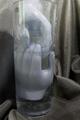
What's on the upper right? |
|
|
|
05/12/2002 10:00:00 PM |
|
Pretty poor lighting distracts greatly from the photo. |
|
|
|
05/12/2002 02:09:00 PM |
|
the blue tint to everything is a little strong for my taste -- I think a warmer tone might be better for a drier sheet -- kind of echo the soft warmth of something right out of a drier |
|
|
|
05/11/2002 06:47:00 AM |
|
oh my goodness, I just figured out the object in top right. Nice work |
|
|
|
05/11/2002 05:37:00 AM |
|
I think maybe filling the pic in more with the product might help. |
|
|
|
05/09/2002 03:13:00 PM |
|
its not snuggley soft.... |
|
|
|
05/09/2002 12:13:00 PM |
|
sorry, this one got beat down by the other bear |
|
|
|
05/08/2002 11:59:00 AM |
|
Very nice how the blue lines lead to the box. |
|
|
|
05/07/2002 04:34:00 AM |
|
Hmm, it's kind of dimly lit and forboding... not a shot that complements the cuteness of the teddy bear logo. |
|
|
|
05/06/2002 10:39:00 PM |
|
this doesnt look very professional. the lighting could be better and it looks more like a photo than an advertisement |
|
|
|
05/06/2002 08:59:00 PM |
|
Snuggles the Bear makes good fish bait! |
|
|
|
05/06/2002 02:18:00 PM |
|
This is a nice photo. I think this photo could possibly use a little stronger lighting. It appears a tad dull at all adjustments on my monitor here. |
|
|
|
05/06/2002 01:54:00 PM |
|
|
|
05/06/2002 01:39:00 PM |
|
compo is awkward.. nice attempt.. but missing something. |
|
|
|
05/06/2002 12:47:00 PM |
|
Good photo, it does advertise pretty good, but little "gotcha" appeal. (I have been saying this alot) Photo 9 Advert 7 Creativity 7 total 7 |
|
|
|
05/06/2002 10:23:00 AM |
I like the perspective.
Top is cut off and there should be more light with the right was cropped off.
It's a fun shot and I like the feel of it. |
|
|
|
05/06/2002 08:43:00 AM |
|
Nice DOF and leading lines. The shot may be a bit dark. |
|
|
|
05/06/2002 06:34:00 AM |
|
Nice try. Lighting is bad. Weird angle. What's the thing on the right? Is it one of those papers? What's the point of the three lines? It leads to the product but it is also distracting. |
|
|
|
05/06/2002 05:21:00 AM |
|
Nice. I would brighten up the photo just a llittle. Otherwise, great shot. |
|
|
|
05/06/2002 12:24:00 AM |
|
Home -
Challenges -
Community -
League -
Photos -
Cameras -
Lenses -
Learn -
Help -
Terms of Use -
Privacy -
Top ^
DPChallenge, and website content and design, Copyright © 2001-2026 Challenging Technologies, LLC.
All digital photo copyrights belong to the photographers and may not be used without permission.
Current Server Time: 06/30/2026 01:22:53 PM EDT.