| Image |
Comment |
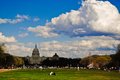
| 04/06/2009 11:51:42 AM |
Capital Building, Washington D.C.by cmtcComment: The appropriately lit foreground does not work with the over dark background at all. The subject also appears to be more the National Mall rather than the Capital building. It's an unfortunate effect of the situational lighting - otherwise it might have worked. It also would have helped if the Capital Building was more centered in the image rather than offset. |
 Photographer found comment helpful. Photographer found comment helpful. |
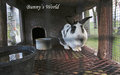
| 04/06/2009 11:46:58 AM |
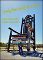
Bunny's Worldby posthumousComment: Very funny - I don't know if the author intended the goose on the left, but the goose's expression is very comical. I really appreciate the author's sense of whimsey and the attempt to throw something together WAY out of the box. Well played. |
| Photographer found comment helpful. |
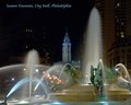
| 04/06/2009 11:43:06 AM |
Swann Fountain, City Hall, Philadelphiaby banmornComment: An iconic image of Philadelphia. The highlights are a touch over done, but it does evoke the impression that somebody has been to Philadelphia. The font is appropriate as is the color, but it's placement is too high and could be brought lower to fill in the dark void above the buildings on the left. |
| Photographer found comment helpful. |
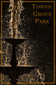
| 04/06/2009 11:32:44 AM |
Tower Grove Parkby bobccComment: Very clever use of the frame and in this case, a transparent frame works well. Proper use of font and color - the overall impression is that this is a location that evokes mystery and adventure - very abstract in concept and execution. By itself, the image would work in any number of challenges. |
| Photographer found comment helpful. |
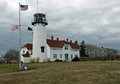
| 04/06/2009 11:29:56 AM |
Cape Cod in the Springtimeby whiterookComment: Another iconic Cape Cod image which is nicely composed. I would like the dramatic sky to be a little more prominent in the image. The image is sharp, crisp, but it has the overall impression of a snapshot and not necessarily the kind of commercial art one would see on a post card. A little different angle with some work on the sky would have improved it's commercial appeal as a post card. |
| Photographer found comment helpful. |
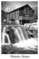
| 04/06/2009 11:26:58 AM |
Old Millby bfurnerComment: An iconic image well composed and captured. Proper font selection, proper color and proper placement outside the image. I'm not much for the whole flowing water technique as it's become a common meme with digital water shots - it gets a little old, but it works here - not effectively, but it does work. |
| Photographer found comment helpful. |
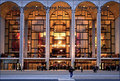
| 04/06/2009 11:23:33 AM |
Visit The Metby PennyStreetComment: I like the author's intent here, but the focus is softer than it should be. If it were sharper, it would have been a great image. The font selection is good, but the underline is not necessary and the color choice was less than thoughtful. It does what it's meant to do though which is represent the Met and it's majesty - it just has those few flaws that mar the overall impact. |
| Photographer found comment helpful. |
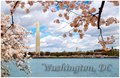
| 04/06/2009 11:20:08 AM |
Cherry Blossom Timeby MaryOComment: A tough one to rate because the composition is perfect, the subject matter is perfect, the font selection and placement is perfect, but the image lacks somewhat in execution. If the color on the blossoms on the right had been carried over to the left, it would have worked perfectly and made the slightly washed out background stand out. As it is though, it's a good depiction of the general impression if you will of Washington. Very nice - good job. |
| Photographer found comment helpful. |
| 04/06/2009 11:12:59 AM |
Roadside Americaby Yo_SpiffComment: A good solid commercial image. The font is appropriate although I would have used a different color. The image seems a little out of focus and the colors are overly saturated - you can't really tell what the red sign says unless you really squint and look closely. It does as intended and that's a plus. |
| Photographer found comment helpful. |
| 04/06/2009 11:10:48 AM |
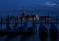
Venice, Italyby good_hamComment: A very clever use of DOF in reverse - it resonates with the impression of romance and history. The font is a little small, but the color is perfect and matches the mood and overall emotional appear - it's not bathetic at all. The background is detailed and rich with color even given the darker cast of blue. Nicely executed. |
| Photographer found comment helpful. |
Home -
Challenges -
Community -
League -
Photos -
Cameras -
Lenses -
Learn -
Help -
Terms of Use -
Privacy -
Top ^
DPChallenge, and website content and design, Copyright © 2001-2025 Challenging Technologies, LLC.
All digital photo copyrights belong to the photographers and may not be used without permission.
Current Server Time: 08/08/2025 05:12:42 AM EDT.