| Author | Thread |
Comments Made During the Challenge  |
|
|
04/09/2009 11:50:00 AM |
|
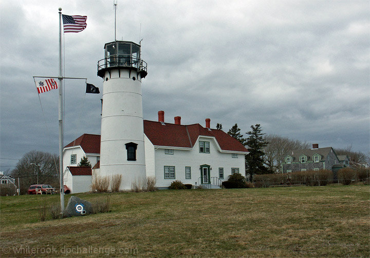
A nice enough scene, but it's coming off to me more like a good snapshot than something to advertise this place. You also could have cloned out that red SUV under the advanced ruleset, and that may have helped a little. Mostly I think it just could benefit from a little more massaging in post processing. |
|
 Photographer found comment helpful. Photographer found comment helpful. |
|
|
04/08/2009 09:10:40 AM |
|
IMO it would have been better with just the lighthouse. |
|
|
|
04/07/2009 01:09:56 AM |
|
i feel like the flag pole is distracting and sorta wish the pic was taken from a little to the right of you possibly nice capture of the essence of cape cod though and new england in spring in general |
|
| Photographer found comment helpful. |
|
|
04/06/2009 07:39:47 PM |
|
no vote , just commenting. I feel that you cropped too tight at the top. Need a little more boost in the colors and a little more sharpness/contrast to make for an interesting postcard |
|
|
|
04/06/2009 12:17:16 PM |
|
Color are really drab and don't intrigue me very much. |
|
|
|
04/06/2009 11:29:56 AM |
|
Another iconic Cape Cod image which is nicely composed. I would like the dramatic sky to be a little more prominent in the image. The image is sharp, crisp, but it has the overall impression of a snapshot and not necessarily the kind of commercial art one would see on a post card. A little different angle with some work on the sky would have improved it's commercial appeal as a post card. |
|
| Photographer found comment helpful. |
|
|
04/06/2009 10:25:41 AM |
|
Im really not liking the colors and the composition. To many cars and power lines on the left. I would have cloned those out and cropped in closer to the lighthouse. |
|
| Photographer found comment helpful. |
Home -
Challenges -
Community -
League -
Photos -
Cameras -
Lenses -
Learn -
Help -
Terms of Use -
Privacy -
Top ^
DPChallenge, and website content and design, Copyright © 2001-2026 Challenging Technologies, LLC.
All digital photo copyrights belong to the photographers and may not be used without permission.
Current Server Time: 06/28/2026 10:33:25 PM EDT.